- Buy Crypto
- Markets
- Futures
- Spot
- Copy Trade
 WE-Launch
What Is the Bitcoin Rainbow Chart and How to Use it?
What Is the Bitcoin Rainbow Chart?
What Is the Bitcoin Rainbow Chart and why has it become so popular among cryptocurrency investors? The Bitcoin Rainbow Chart serves as both an educational tool and a visual framework for identifying long-term price trends in the cryptocurrency market. Using a spectrum of colors to represent different valuation phases, this chart provides traders with an intuitive way to assess market conditions. This comprehensive guide explores the chart's functionality, historical background, practical applications, and important limitations.
How to Understand the Bitcoin Rainbow Chart?
When examining the Bitcoin rainbow chart, you'll notice it applies logarithmic scaling to Bitcoin's price history, overlaying colored bands that indicate various market phases. Each hue corresponds to a specific sentiment level:
- Dark Blue ("Basically a Fire Sale"): Severe undervaluation
- Cyan ("BUY!"): Significant undervaluation
- Green ("Accumulate"): Moderate undervaluation
- Light Green ("Still cheap"): Slight undervaluation
- Yellow ("HODL!"): Fair valuation
- Orange ("Is this a bubble?"): Potential overvaluation
- Light Red ("FOMO intensifies"): Likely overvaluation
- Red ("Sell. Seriously, SELL!"): Significant overvaluation
- Dark Red ("Maximum Bubble Territory"): Extreme overvaluation
The bitcoin price rainbow chart employs logarithmic regression analysis to normalize Bitcoin's characteristic volatility, creating smoothed bands that emphasize long-term trends over short-term fluctuations. This mathematical approach distinguishes it from conventional bitcoin charts rainbow displays that simply overlay colors on standard price charts.
Historical Development and Evolution
The concept originally emerged in 2014 from Reddit user "azop," who proposed using colored bands on a logarithmic scale to visualize Bitcoin's price trajectory. The initial version provided a basic framework for understanding market cycles through color-coded valuation zones.
In 2019, cryptocurrency enthusiast Rohmeo enhanced the original model, creating what became known as Bitcoin Rainbow Chart V2. This refined version introduced the distinctive arched appearance and improved the mathematical foundation determining band boundaries. The updated bitcoin chart rainbow gained popularity through platforms like BlockchainCenter and various technical analysis websites.
Practical Application Guide
Implementing the bitcoin price chart rainbow in your analysis involves several key steps:
- Current Phase Identification: Locate Bitcoin's present position within the color spectrum. This immediate visual reference indicates the prevailing market sentiment.
- Color Interpretation: Cooler tones (blues and greens) suggest potential buying opportunities, while warmer shades (oranges and reds) indicate caution zones. The specific color provides context for current valuation levels.
- Historical Pattern Analysis: Examine how Bitcoin previously behaved in similar color zones. Historical comparisons can reveal recurring patterns across market cycles.
- Supplementary Analysis Integration: Combine Rainbow Chart observations with other technical indicators like moving averages, RSI, or trading volume data. Some analysts also correlate findings with Bitcoin's Stock-to-Flow model for additional long-term perspective.
The chart functions best as a strategic planning aid rather than a precise timing tool, helping frame broader market context.
Interpreting Chart Signals for Market Analysis
Each color zone in the Bitcoin rainbow chart conveys distinct market implications:
- Blue-Green Spectrum (Accumulation Phase): These levels historically represent potential accumulation zones where Bitcoin may be trading below its long-term average valuation.
- Yellow Zone (Equilibrium): Indicates a balanced market where Bitcoin trades near its perceived fair value based on historical trends.
- Orange-Red Spectrum (Distribution Phase): Suggests growing market enthusiasm that may signal overextended valuations and potential correction periods.
The color transitions help visualize market cycle progression from accumulation through distribution phases.
Understanding Alternative Versions
While this guide focuses on Bitcoin, traders should note that alternative versions like the bitcoin cash rainbow chart have emerged, applying similar color-band methodology to other cryptocurrencies. However, these derivative charts typically have shorter historical data and may not demonstrate the same reliability as the original Bitcoin model.
Advantages of Rainbow Chart Analysis
Traders utilize what is bitcoin rainbow chart methodology for several compelling reasons:
- Immediate Visual Context: The color-coded system enables rapid assessment of market conditions without complex calculations.
- Long-Term Focus: By emphasizing multi-year trends, the chart helps maintain perspective during short-term market volatility.
- Accessible Design: The intuitive color system makes technical analysis approachable for newcomers while still valuable for experienced analysts.
- Educational Framework: The chart effectively illustrates Bitcoin's historical market cycle patterns and valuation extremes.
- Decision Support: When combined with other analysis methods, the chart contributes to more informed investment decisions.
Accuracy and Reliability Assessment
The Rainbow Chart's predictive capability remains subject to ongoing discussion:
- Historical Foundation: The model effectively captures past price behavior but cannot guarantee future performance.
- Statistical Smoothing: Logarithmic regression minimizes noise but may overlook fundamental market shifts or unprecedented events.
- Parameter Subjectivity: Color band thresholds involve interpretation and may vary between different analysts or updated versions.
While the bitcoin rainbow chart provides valuable historical context, it should be considered a guide rather than a definitive prediction tool.
Connection to Bitcoin Halving Events
Bitcoin's quadrennial halving events, which reduce mining rewards by 50%, historically correlate with interesting bitcoin charts rainbow patterns:
The chart frequently shows Bitcoin occupying lower color bands around halving periods, suggesting potential undervaluation based on historical norms. Subsequent market cycles have sometimes demonstrated upward price movement into higher color zones as reduced supply emission interacts with market demand.
This relationship provides additional context for understanding long-term valuation trends, though halving events don't guarantee specific price outcomes.
Important Limitations and Considerations
Several factors warrant consideration when using what is the bitcoin rainbow chart methodology:
- Backward-Looking Nature: The model primarily reflects historical patterns rather than forecasting future developments.
- Simplified Framework: The color-based system doesn't incorporate external factors like regulatory changes or macroeconomic conditions.
- Subjectivity in Band Definitions: Valuation thresholds between colors involve interpretation and may evolve as markets mature.
- Long-Term Orientation: The bitcoin chart rainbow design emphasizes multi-year trends over short-term trading signals.
- Market Evolution Impact: As Bitcoin's market structure develops, historical patterns may become less reliable indicators.
Conclusion
The Bitcoin Rainbow Chart offers a unique visual approach to understanding Bitcoin's long-term price behavior and market cycle positioning. Its color-coded system provides immediate context for current valuation levels relative to historical patterns. While particularly valuable for educational purposes and strategic planning, the bitcoin price rainbow chart functions most effectively when combined with other analytical methods and current market fundamentals.
As with any technical tool, what is bitcoin chart rainbow methodology serves best as a component within a comprehensive analysis framework rather than a standalone decision-making system. Its greatest value lies in helping maintain long-term perspective during short-term market fluctuations.
Further Reading
- What is Bitcoin’s Funding Rate and Why It Matters?
- User Guide: How to Make Money with Bitcoin in 5 Different Ways?
- How to Trade Crypto Responsibly?
Disclaimer: The opinions expressed in this article are for informational purposes only. This article does not constitute an endorsement of any of the products and services discussed or investment, financial, or trading advice. Qualified professionals should be consulted prior to making financial decisions.
FAQ
What primary function does the Bitcoin Rainbow Chart serve? It provides a visual representation of Bitcoin's long-term price trends using color-coded valuation bands, helping identify potential undervaluation or overvaluation periods.
Is the Rainbow Chart suitable for short-term trading strategies? The bitcoin price chart rainbow design emphasizes long-term trends and may not capture short-term trading opportunities effectively. Day traders typically supplement it with more responsive indicators.
How do halving events relate to the Rainbow Chart patterns? Historically, Bitcoin has often occupied lower color bands during halving periods, with potential upward movement through the color spectrum in subsequent months, though this pattern isn't guaranteed.
Can the Rainbow Chart predict future Bitcoin prices accurately? While it provides valuable historical context, no technical tool can reliably predict future prices. The bitcoin rainbow chart serves best as a guide to market sentiment rather than a precise forecasting instrument.
You may also like

Elon Musk Calls Bitcoin “True Currency”: What It Means for BTC Markets
Elon Musk has once again stirred the crypto conversation, this time by calling energy the true currency.
The Tesla and SpaceX CEO shared this perspective on the social platform X while engaging in a discussion about money, energy, and artificial intelligence.
Although Musk did not explicitly mention Bitcoin in his statement, the cryptocurrency community was quick to draw a direct connection. Bitcoin has long been framed by its proponents as a form of "stored energy"—a digital asset whose security and issuance are fundamentally backed by real-world electricity and computational power.
As market participants closely monitor Musk’s public remarks, his latest comments have reignited a deeper debate about the nature of value itself, and what role Bitcoin might ultimately play in the future monetary system.
Why Elon Musk Calls Energy as True Currency?Musk’s perspective is grounded in principles of physics and resource economics. Energy is the fundamental input that powers all economic activity—from industrial production to data computation. In this framework, traditional currencies are seen merely as accounting tools to facilitate the transfer and measurement of energy over time and space.
Musk has been openly critical of fiat currency systems, highlighting their susceptibility to manipulation and unlimited issuance. Energy, on the other hand, cannot be created from nothing; its production requires tangible infrastructure, raw materials, and continuous input, imposing natural constraints that stand in contrast to the elasticity of government-issued money.
Proponents of Bitcoin argue that this energy-centric worldview aligns seamlessly with Bitcoin’s design. The mining process deliberately ties the creation of new bitcoins and the security of the network to substantial electricity consumption, thereby anchoring its economic cost in physical reality.
This conceptual link explains why Musk’s statements—even when not naming Bitcoin directly—often trigger speculation and discussion within crypto markets.
How Bitcoin Fits the Energy Narrative?Bitcoin is frequently described as monetized energy. The network’s transaction ledger is secured through a competitive mining process where participants expend electricity to solve cryptographic puzzles. As the price of Bitcoin rises, mining becomes more profitable, attracting greater computational power and further increasing energy consumption—which in turn enhances the network’s security.
Why Supporters Call Bitcoin Conserved Energy?This idea gained significant attention after earlier remarks from Musk describing Bitcoin as “based on energy” and contrasting it with fiat currencies that can be “printed at will.” Core arguments supporting this view include:
Bitcoin’s supply is algorithmically capped at 21 million coins.Mining difficulty automatically adjusts based on the total computational power dedicated to the network.The security of the blockchain scales directly with the amount of real-world energy utilized.Some investors interpret this as a more transparent and constrained monetary system. Critics, however, raise concerns about environmental sustainability and the long-term viability of an energy-intensive consensus mechanism. Regardless of stance, Musk’s commentary consistently brings this tension back into public discourse.
Market Reactions and Investor SentimentWhile Musk’s direct influence on crypto prices has moderated since the peak of the 2020–2021 market cycle, his statements continue to shape trader sentiment and media narratives. Bitcoin’s market movements often correlate as strongly with shifts in conceptual narrative—especially those tied to technology, energy, and macroeconomics—as with specific regulatory or institutional developments.
Why Markets Still Listen to Musk?Musk remains a uniquely influential figure at the intersection of technology, energy, and futurism. His companies, Tesla and SpaceX, are deeply engaged in energy innovation and large-scale infrastructure. Meanwhile, the explosive growth of artificial intelligence is dramatically increasing global electricity demand—a trend that indirectly highlights the themes of energy scarcity and allocation that underpin Bitcoin’s value proposition.
Some analysts believe this broader context reinforces Bitcoin’s long-term narrative as a scarce digital commodity backed by real-world resource expenditure. Musk’s recent allusion to AI as a potential “infinite money glitch” further fuels theoretical discussions about value in a digitized, energy-aware economy.
That said, Musk’s relationship with Bitcoin has been notably nuanced. After a period of overt support, his stance has become more measured, and he continues to express personal favor toward Dogecoin. This ambiguity leads markets to interpret rather than blindly follow his comments, adding a layer of narrative volatility without consistent directional pressure.
ConclusionElon Musk’s characterization of energy as the true currency may read as philosophical, but it resonates deeply with one of Bitcoin’s core value narratives. By framing monetary value in terms of fundamental physical resources, Musk indirectly reinforces the idea that Bitcoin represents a credible alternative to traditional fiat systems—not through direct endorsement, but through conceptual alignment.
For observers and participants in the crypto space, this underscores how Bitcoin’s market valuation is often propelled by ideological and narrative currents as much as by technical or on-chain metrics. As the digital asset landscape continues to mature, engaging with these foundational ideas remains essential for understanding Bitcoin’s potential role in a reimagined global economy.
Ready to trade Bitcoin?Join WEEX now—enjoy zero trading fees, smooth execution, and instant access. Sign up today and start trading in minutes.
Further ReadingHow to Trade Bitcoin Futures on WEEX?What Is Bitcoin and How Does It Work?If You Invested $1,000 in Bitcoin 10 years ago, Here’s How Much You’d Have NowBitcoin at $126,000: What's Next?Disclaimer: The opinions expressed in this article are for informational purposes only. This article does not constitute an endorsement of any of the products and services discussed or investment, financial, or trading advice. Qualified professionals should be consulted prior to making financial decisions.

Which Crypto Will Go 1000x in 2026?
Examining historical 1000x gainers reveals patterns centered on timing, narrative, and network effects rather than predictable fundamentals. Such extraordinary returns typically emerge from assets that started with low valuations, aligned with powerful cultural or technological shifts, and captured momentum at the right phase of a broader market cycle.
Bitcoin (BTC): Initially valued at pennies, Bitcoin introduced decentralized digital scarcity and established a new asset class. Its growth beyond 1000x was fueled by growing institutional trust, global adoption, and its evolution into a macroeconomic reserve asset over multiple cycles.Ethereum (ETH): Launched as a smart contract platform, Ethereum unlocked decentralized applications, DeFi, and NFTs. Early participants realized exponential gains as its ecosystem became the foundation for Web3 innovation.Dogecoin (DOGE): Originally created as a humorous experiment, Dogecoin leveraged community-driven virality and celebrity endorsement to achieve parabolic returns, demonstrating the power of meme culture in financial markets.Shiba Inu (SHIB): Starting with a micro-cap valuation, SHIB capitalized on meme coin mania and retail frenzy, delivering gains measured in tens of thousands of percent through exchange listings and expanding ecosystem narratives.Pepe (PEPE): A 2023 entrant with no functional utility, PEPE illustrated how internet-native memes can rapidly translate into speculative financial assets, briefly generating multi-billion-dollar valuations purely through social momentum.These cases underscore that 1000x outcomes are less about guarantees and more about early exposure, compelling storytelling, and favorable market psychology.
Top Cryptos With 1000x Potential in 2026Identifying tokens with 1000x potential requires a focus on the high-risk, high-reward segment of the market. The following assets represent speculative narratives that could attract extreme capital flows during aggressive bull phases. All projections are illustrative and assume optimal market conditions.
Bitcoin Hyper (HYPER): Positions as a Bitcoin Layer-2 solution aiming to extend functionality beyond store of value. Benefits from strong Bitcoin-centric narratives during BTC-led market cycles.Dogecoin (DOGE): As one of the most recognized cryptocurrencies globally, DOGE retains potential for resurgence driven by community loyalty, social media trends, and celebrity influence.Pepe (PEPE): A pure meme asset relying entirely on cultural virality and speculative momentum, historically capable of rapid multi-billion dollar valuation spikes.Shiba Inu (SHIB): Evolved from a meme token into an ecosystem with its own Layer-2 network, combining community scale with ongoing development to sustain speculative interest.These tokens are characterized by high volatility, narrative dependency, and sensitivity to broader market sentiment. Position sizing and exit planning are critical when engaging with such assets.
High-Growth Cryptos That Could Still Deliver Significant ReturnsNot all opportunities require extreme risk. Many investors achieve substantial returns through established projects with clearer fundamentals, growing adoption, and ecosystem maturity. While unlikely to deliver 1000x from current valuations, these assets can still produce strong performance in favorable market conditions.
Maverick Protocol (MAV): A decentralized exchange emphasizing capital efficiency for liquidity providers. Positioned to benefit from renewed DeFi activity and trading volume expansion in bull markets.Sui (SUI): A high-throughput Layer-1 blockchain focused on consumer applications like gaming and payments. Gains traction through developer adoption and scalability narratives.Aptos (APT): A scalable Layer-1 with institutional backing, increasingly associated with real-world asset tokenization and enterprise use cases.These projects represent a more balanced risk-return profile, appealing to investors seeking exposure to crypto growth with relatively stronger fundamental grounding.
Can These Cryptos Make You a Millionaire?The possibility exists, but it is contingent on specific and often unforgiving conditions. True millionaire-making outcomes typically require:
Exceptionally early entry before broad recognitionFavorable macro and market cycle timingDisciplined position management and profit-takingMost successful crypto wealth stories involve a portfolio approach, where one or two high-conviction winners offset other positions. Equally important is the discipline to secure gains—many paper millionaires fail to realize profits by holding through volatile downturns.
While the assets discussed could theoretically generate life-changing returns, achieving such results depends far more on strategy, risk management, and emotional control than on merely selecting the "right" token.
Conclusion: Which Crypto Will Give 1000x in 2026?There is no definitive answer, as 1000x returns are inherently unpredictable and historically rare. They tend to emerge from narratives that resonate deeply during specific market phases, often beginning as overlooked or dismissed ideas.
Investors should balance ambition with pragmatism: high-risk meme and narrative-driven tokens offer theoretical upside but come with extreme volatility and failure rates. More established projects provide growth potential with comparatively lower risk.
Ultimately, the search for exponential returns is less about prediction and more about preparation—staying informed, managing exposure, maintaining discipline, and recognizing that in crypto, timing and psychology often outweigh fundamentals in the short to medium term.
Further ReadingWhat Is Dogecoin and How Does It Work?What Is Ethereum and How Does It Work?What Is Shiba Inu and How Does It Work?Disclaimer: The opinions expressed in this article are for informational purposes only. This article does not constitute an endorsement of any of the products and services discussed or investment, financial, or trading advice. Qualified professionals should be consulted prior to making financial decisions.

What is RSI Divergence and How It Works?
RSI divergence occurs when an asset's price moves in one direction while its Relative Strength Index (RSI) moves in the opposite direction. This discrepancy between price action and underlying momentum often indicates potential trend weakening or a forthcoming reversal.
Traders use RSI divergence as an early signal that a prevailing trend may be losing strength, which can help identify potential market tops or bottoms. The concept is applicable across various timeframes and can assist in decisions to enter, exit, or adjust positions.
What is the RSI and How Is It Calculated?The Relative Strength Index (RSI) is a momentum oscillator that quantifies the magnitude and speed of price changes over a defined period—typically 14 periods. The index oscillates between 0 and 100.
In essence, RSI compares the average gains and losses over the selected period. A higher RSI (closer to 100) indicates stronger buying momentum, while a lower RSI (closer to 0) reflects stronger selling pressure. Levels above 70 are generally considered overbought, and levels below 30 are viewed as oversold—conditions that may precede price reversals.
Most modern trading platforms calculate RSI automatically, allowing traders to focus on interpretation rather than computation. Due to its clarity and adaptability, RSI is widely used across equities, forex, and cryptocurrency markets.
How to Define RSI Divergence?Divergence is identified when the price forms a new high or low that is not confirmed by a corresponding new extreme in the RSI.
Bullish Divergence: Price records a lower low, while RSI forms a higher low.Bearish Divergence: Price makes a higher high, while RSI makes a lower high.These patterns suggest underlying momentum is weakening, even if price action appears strong. Divergences do not guarantee reversals but increase the probability of a shift when observed within a broader technical context. Traders often use historical backtesting to assess the reliability of divergence signals in different market environments.
Types of RSI DivergenceRegular Bullish Divergence Occurs during a downtrend: price makes lower lows, but RSI forms higher lows. This signals decreasing selling pressure and may precede a bounce or trend reversal upward.Regular Bearish Divergence Appears in an uptrend: price reaches higher highs, while RSI makes lower highs. This indicates fading bullish momentum and can be used to prepare for short entries or exit long positions.Hidden Bullish Divergence Observed in an uptrend: price forms a higher low, but RSI prints a lower low. This suggests the underlying uptrend remains intact and a pullback may be ending.Hidden Bearish Divergence Seen in a downtrend: price makes a lower high, while RSI creates a higher high. This reinforces the ongoing downtrend and can be used to add or maintain short positions during retracements.Recognizing these variations helps traders align decisions with the prevailing market structure.
How to Spot RSI Divergence?Apply a 14-period RSI to your price chart.Identify significant highs and lows in both price and RSI.Draw trendlines connecting these extremes in each window.Look for opposing slopes between the price and RSI trendlines—this confirms divergence.Use breaks of key support/resistance or trendline violations as additional confirmation before acting on the signal.When Does RSI Divergence Work Best?RSI divergence tends to be more reliable on higher timeframes—such as daily or weekly charts—and after a sustained directional move. It is less effective during parabolic or extremely strong trends, where momentum and price may remain disconnected for extended periods.
Context is critical. Combining divergence with other confirming factors—such as key support/resistance levels, volume patterns, or candlestick formations—increases the robustness of the signal.
Common RSI Divergence PitfallsDivergence signals possible weakening, not certain reversal. Strong trends may consolidate before resuming.Signals can be invalidated if price continues to make new extremes despite RSI divergence.Lower timeframe divergences carry less weight and often indicate only short-term corrections within a larger trend.Overreliance on divergence without confluence from other indicators increases risk.General RSI Trading GuidelinesUse RSI alongside other technical tools to build a multi-factor view of market conditions.Analyze multiple timeframes to gauge the strength and scope of a potential reversal.Always define invalidation levels and employ stop-loss orders to manage risk.Trade in probabilities, not certainties—no signal guarantees success.Exercise patience: wait for confluence rather than entering solely on divergence.Consider intermarket dynamics, especially in crypto—Bitcoin’s trend often influences altcoin behavior.Base divergence analysis on closing prices rather than intra-candle wicks for clearer signals.Trading Strategies Using RSI Divergence
Reversal Strategy (Regular Divergence)Entry: After confirmation, such as RSI crossing a key level or price breaking a trendline.Stop-loss: Placed beyond the recent swing high/low.Take-profit: Set near previous support or resistance.Trend Continuation Strategy (Hidden Divergence)Entry: On a pullback within a prevailing trend, supported by hidden divergence.Confirmation: RSI crossing back above/below 50, or price resuming its trend direction.Real-World Example: Bitcoin in Late 2022
In November 2022, Bitcoin established a significant market bottom near $15,500. Analysis of the weekly chart revealed a clear bullish divergence: price made a lower low while RSI formed a higher low. This was accompanied by a volume spike at the lows—a common capitulation signal—before the market reversed into a new uptrend.
ConclusionRSI divergence is a valuable technical tool for identifying potential trend reversals and continuations. Regular divergences often flag trend changes, while hidden divergences support staying with the existing trend. By integrating these patterns into a structured trading plan—supported by risk management and additional technical confirmation—traders can enhance decision timing and trade with greater discipline. Remember, divergence alone does not assure success, but it provides probabilistic signals that can improve overall trading effectiveness when used thoughtfully.
Further ReadingWhen the Market is Down, What Should We Do?What Are Crypto Signals and How to Use them?Crypto Trading vs.Traditional Investment, What's the Difference?Disclaimer: The opinions expressed in this article are for informational purposes only. This article does not constitute an endorsement of any of the products and services discussed or investment, financial, or trading advice. Qualified professionals should be consulted prior to making financial decisions.

The Fed Cuts Rates Again: How This Macro Impact Crypto In 2026?
When the Federal Reserve lowers interest rates, several systemic shifts typically unfold: borrowing costs decrease, financial system liquidity expands, the U.S. dollar often softens, and investor capital tends to migrate toward higher-growth, higher-risk assets. Cryptocurrency markets frequently respond more swiftly to accommodative monetary policy than traditional equities do, positioning digital assets as early beneficiaries of a dovish pivot. While short-term volatility persists, the directional shift in Fed policy establishes an important macro backdrop for longer-term positioning in Bitcoin, Ethereum, and select altcoins.
The Fed Is Adding LiquidityThe Fed’s accompanying announcement to purchase $40 billion in Treasury bills over the next 30 days represents a deliberate injection of liquidity into the financial system. Such operations increase the supply of available capital, which historically flows into risk-on markets—including cryptocurrencies. This liquidity supports not only core assets like Bitcoin and Ethereum but also extends to large-cap altcoins and high-activity thematic sectors such as AI-driven tokens, layer‑2 scaling solutions, and real-world asset (RWA) protocols.
Why Crypto Has Not Surged Immediately?Despite the policy shift, cryptocurrency markets have not exhibited an immediate, broad-based rally. Several factors contribute to this delayed reaction:
Recent Market Stress: Significant liquidations and selloffs in prior sessions have left traders in a cautious, wait-and-see posture.Desire for Confirmation: Participants often await subsequent Fed communications, updated economic projections, and tangible evidence of sustained liquidity before committing capital decisively.Residual Macro Uncertainty: Commentary regarding labor market revisions and persistent inflation concerns continues to influence near-term sentiment.While the initial price response may be muted, a sustained shift toward easier monetary policy typically lays the groundwork for stronger performance in subsequent crypto market phases.
How This Macro Impact Crypto In 2026?Should the Fed maintain or extend its current dovish trajectory, several developments could unfold in cryptocurrency markets through 2026:
Gradual but steady capital inflows into Bitcoin and EthereumAccelerated recovery and rotation within altcoin sectorsRenewed interest in thematic narratives such as AI, layer‑2 scaling, and tokenized real-world assetsEnhanced trading opportunities amid structurally higher volatility environmentsMacro policy conditions often exert greater influence on crypto market cycles than individual news events, and a sustained move toward lower rates historically supports extended upward trends over time.
What Traders Should Consider?A practical monitoring framework in the current environment includes:
Bitcoin Dominance: BTC frequently leads during macro-driven inflection points.U.S. Dollar Index (DXY): A weakening dollar generally correlates with strength in Bitcoin and Ethereum.Sector Rotation: Tokens tied to AI, RWAs, and layer‑2 infrastructure often exhibit early momentum when liquidity conditions improve.Fed Communication: Forward guidance regarding the pace and extent of future rate cuts can trigger immediate market responses.ConclusionThe Federal Reserve’s latest 25‑basis‑point rate cut—the third of the year—coupled with its announced Treasury bill purchases, marks a clear transition toward more accommodative monetary policy. While cryptocurrency prices may not react instantaneously, these developments contribute to a macro foundation that has historically supported renewed market expansion. Traders who contextualize price action within this shifting liquidity and rate environment may be better positioned to navigate the evolving landscape through 2026.
Further ReadingGlobal Crypto Regulation 2025: Everything You Must KnowWhat Crypto Traders Do in a Bearish Market 2025?If You Invested $1,000 in Bitcoin 10 years ago, Here’s How Much You’d Have NowDisclaimer: The opinions expressed in this article are for informational purposes only. This article does not constitute an endorsement of any of the products and services discussed or investment, financial, or trading advice. Qualified professionals should be consulted prior to making financial decisions.

Global Crypto Regulation 2025: Everything You Must Know
Cryptocurrency has evolved into a significant global asset class, with its total market capitalization surpassing $3 trillion in recent years. As adoption continues to expand, governments worldwide are grappling with the complex task of regulating a technology that is at once innovative, decentralized, and highly volatile. The result is a diverse and often fragmented landscape of Global Crypto Regulation—spanning from outright prohibition to proactive legal frameworks designed to foster innovation.
In 2025, this landscape can generally be categorized into four distinct approaches adopted by different jurisdictions, each reflecting varying levels of acceptance, control, and strategic intent.
Red Light CountriesThese nations maintain stringent prohibitions or severe restrictions on cryptocurrency activities, often citing concerns related to financial stability, capital controls, or national security within their Global Crypto Regulation framework.
China: While continuing to promote its central bank digital currency (the digital yuan) and supporting blockchain infrastructure, China upholds a comprehensive ban on cryptocurrency trading and mining. Enforcement measures include monitoring, fines, and in some cases, criminal penalties.Algeria: The possession, trading, or promotion of cryptocurrencies is criminalized, with violations carrying the risk of significant fines and imprisonment.Despite these prohibitions, peer-to-peer and underground trading often persist, driven by public demand and the borderless nature of digital assets, challenging the enforcement of strict Global Crypto Regulation.
Yellow Light CountriesJurisdictions in this category permit cryptocurrency under a regulated framework, emphasizing legal clarity, consumer protection, and anti-money laundering (AML) compliance as part of their approach to Global Crypto Regulation.
European Union: The Markets in Crypto-Assets (MiCA) regulation establishes comprehensive licensing requirements for exchanges, stablecoin issuers, and other crypto service providers, representing a major milestone in Global Crypto Regulation. The Digital Operational Resilience Act (DORA) further strengthens cybersecurity and operational standards.Japan: Recognized as an early adopter of crypto regulation, Japan requires exchanges to register with the Financial Services Agency (FSA), implement strict KYC/AML procedures, and adhere to custody and reporting rules.These regulatory environments seek to balance innovation with oversight, providing a structured pathway for legitimate crypto businesses to operate within the evolving Global Crypto Regulation landscape.
Green Light CountriesThese nations actively encourage cryptocurrency adoption and aim to position themselves as hubs for digital asset innovation and investment, often through progressive Global Crypto Regulation.
United Arab Emirates: Through regulatory bodies such as the Virtual Assets Regulatory Authority (VARA) in Dubai and the Financial Services Regulatory Authority (FSRA) in Abu Dhabi, the UAE has created clear, progressive frameworks that attract global crypto enterprises and set benchmarks in Global Crypto Regulation.El Salvador: While maintaining Bitcoin as legal tender, the country has faced implementation challenges and has adjusted certain policies in response to practical and economic considerations, offering a unique case study in Global Crypto Regulation.Such jurisdictions often leverage crypto-friendly policies to stimulate technological development, foreign investment, and financial inclusion.
Roadwork or Under ConstructionA number of countries are still in the process of developing comprehensive crypto regulations, resulting in a state of legal ambiguity or selective enforcement that complicates Global Crypto Regulation coherence.
India: While applying certain AML measures and tax reporting requirements, India has yet to enact a holistic crypto law, leaving businesses and users in a gray area within the broader context of Global Crypto Regulation.Nigeria: The country has taken steps to recognize cryptocurrencies as securities, but regulatory consistency and enforcement remain uneven.In these markets, uncertainty can both hinder institutional participation and create opportunities for adaptive local ecosystems, highlighting the uneven pace of Global Crypto Regulation development.
Major Crypto Laws and Compliance Trends in 2025United States
The GENIUS Act focuses on stablecoin regulation, mandating full reserve backing, regular audits, and consumer protections, reflecting a significant development in Global Crypto Regulation.The CLARITY Act seeks to distinguish between digital commodities and securities, while the Anti-CBDC Surveillance State Act aims to restrict the deployment of a U.S. central bank digital currency without explicit congressional approval.European Union
MiCA provides a unified regulatory framework for crypto-assets across the EU, covering licensing, transparency, and governance, representing a cornerstone of European Global Crypto Regulation.DORA imposes stringent operational resilience and cybersecurity requirements on financial entities, including crypto service providers.Asia
Hong Kong’s Stablecoins Ordinance introduces a licensing regime for issuers, requiring full asset backing and regular reporting, contributing to the maturation of Global Crypto Regulation in the region.Singapore’s FIMA Act expands the Monetary Authority of Singapore’s oversight to include crypto derivatives and enhances its inspection powers.Middle East
UAE’s VARA regulates a wide range of virtual asset activities, including issuance, exchange services, and custody, serving as a model for progressive Global Crypto Regulation.Abu Dhabi’s FSRA enforces licensing, minimum capital requirements, and restrictions on privacy-focused tokens and algorithmic stablecoins.These legislative developments reflect a global trend toward greater transparency, risk mitigation, and institutionalization of the crypto sector within the broader context of Global Crypto Regulation.
How Global Crypto Regulation 2025 Will Impact?For InvestorsClear regulatory frameworks in Global Crypto Regulation help reduce fraud, provide tax guidance, and enhance market integrity, though compliance requirements may also increase operational complexity.
For BusinessesAdherence to Global Crypto Regulation can serve as a competitive differentiator, enabling access to broader markets and fostering trust among users and partners.
For Global MarketsHarmonized rules—or at least mutually recognized standards—in Global Crypto Regulation facilitate cross-border services, liquidity flows, and international cooperation in supervision and enforcement.
Trends to WatchIncreased focus on stablecoin reserve transparency and issuer accountability within Global Crypto Regulation frameworks.Growth of multi-jurisdictional licensing models for global crypto platforms in response to evolving Global Crypto Regulation.Emerging markets exploring adaptive regulatory sandboxes to attract fintech innovation while shaping their own approaches to Global Crypto Regulation.ConclusionThe landscape of Global Crypto Regulation in 2025 is characterized by significant diversity, reflecting differing national priorities, risk appetites, and economic strategies. From restrictive bans to innovation-friendly frameworks, each approach shapes how digital assets are accessed, used, and integrated into the broader financial system.
As Global Crypto Regulation continues to mature, participants across the ecosystem—from individual users to institutional players—will benefit from staying informed, engaging compliantly, and adapting to an environment where legal clarity is increasingly synonymous with sustainable growth.
Ready to be part of this evolving crypto revolution? Join WEEX today — where innovation meets compliance and opportunity awaits. Sign up now and start trading securely in a globally connected marketplace!
Further ReadingHow to Trade Bitcoin Futures on WEEX?What Is Bitcoin and How Does It Work?If You Invested $1,000 in Bitcoin 10 years ago, Here’s How Much You’d Have NowBitcoin at $126,000: What's Next?Disclaimer: The opinions expressed in this article are for informational purposes only. This article does not constitute an endorsement of any of the products and services discussed or investment, financial, or trading advice. Qualified professionals should be consulted prior to making financial decisions.

BOB Airdrop 50,000 USDT – New User Welcome Reward | Deposit, Trade & Earn
Event Period:
2025/12/04 18:00:00 – 2025/12/11 18:00:00 (UTC+8)
BOB is creating a next-generation Bitcoin DeFi Gateway, combining Bitcoin’s security with Ethereum’s flexibility. As a leading hub for Bitcoin liquidity and decentralized applications, BOB allows users and institutions to unlock real utility within the Bitcoin ecosystem.
To celebrate, WEEX is launching a 50,000 USDT BOB Airdrop exclusively for new users. Complete simple tasks to earn spot and futures rewards, plus access a shared prize pool.
Event 1: First Deposit & Spot Trade (Get 10 USDT)Make a net deposit ≥ 100 USDTHold the deposit until the event endsComplete your first spot trade in eligible tokensReward: 10 USDTLimited to 1,000 participants (first-come, first-served)This task is designed to help new users start trading on WEEX while earning stable rewards.
Event 2: Futures Trading Volume Task (Earn up to 20 USDT + Bonus)Reach the designated futures trading volume in any contract to claim:
Base RewardRequired Trading Volume5 USDT500 USDT10 USDT5,000 USDT20 USDT10,000 USDTAdditionally, users completing Event 1 can claim an extra 5 – 10 USDT futures bonus.
Rewards are limited to 1,000 participants.
This pool encourages deeper engagement for users exploring futures trading on WEEX.
Reward EligibilityTo claim all rewards:
Complete Event 1 → Event 2 in sequenceUsers who do not follow the order will not be eligible for reward distribution.Why Join the BOB Airdrop?50,000 USDT total rewardsEasy onboarding tasksExtra futures bonusesShared prize pool for active tradersLimited-quota, high-value new user eventThis is one of the highest-value BOB ecosystem onboarding events, ideal for users starting their Bitcoin DeFi journey on WEEX.

Step-by-Step: Buy Bitcoin(BTC) via RUB on WEEX P2P
Want to buy Bitcoin (BTC) via RUB quickly and securely? Many traders struggle with slow transactions, high fees, and untrustworthy sellers. WEEX P2P solves these problems by offering a fast, secure, and user-friendly platform where you can complete your crypto purchase in just a few clicks. Whether you’re a beginner or an experienced trader, WEEX P2P makes buying bitcoin easy and worry-free, keeping you updated with the latest market trends and giving you full control over your trades.
What is WEEX P2P?WEEX P2P is a peer‑to‑peer trading platform that connects buyers and sellers directly — letting you pay RUB and receive Bitcoin (or other supported cryptocurrencies) without complicated steps. This model gives you greater flexibility and control over your trades, compared to traditional centralized exchanges. On WEEX, you only trade with other verified users and use escrow protection to ensure fairness. The platform supports a variety of local payment methods and other fiat currencies.
Why WEEX P2P is the Best Choice in 2025?WEEX P2P provides several advantages that make it the top platform to buy USDC. Buyers enjoy zero transaction fees, while professional merchants ensure fast confirmations and smooth trade execution at all hours. WEEX’s official escrow service protects every transaction end-to-end, removing all counterparty risk.
0% fee for buyers (save 2-8% vs competitors)Average trade completion: under 3 minutesOfficial escrow protection – 100% safeSupports from 500 [Currency] up to millionsMore [Payment Method] ads than any other platformStep-by-Step: Buy Bitcoin (BTC) via RUB in MinutesGrabbing Bitcoin (BTC) on WEEX feels like a seamless UPI top-up—no jargon, no waits. Here's your quick path, straight from the app:
Sign Up & Verify: Download WEEX (iOS/Android/web), enter your phone/email, set a password—done in 20 seconds. Snap your Aadhaar/PAN for KYC (under 60 seconds approval, unlocking full limits).Select an offer: Go to the “Buy” tab on the P2P page. Choose Bitcoin (BTC) as the crypto you want, and RUB as your payment currency. From the list of sellers, select one whose terms (price, payment method, limits, completion rate) suit your needs.Input the amount: Input how much RUB you want to spend, confirm the seller, and complete payment using the chosen method.Receive Bitcoin (BTC): Once the seller confirms receipt of payment, the escrowed Bitcoin (BTC) will be released to your Funding Account.Also, you can check out this video to know more about WEEX P2P.
Notice: Always Stay SecureWhile WEEX P2P offers convenience, it’s important to remain cautious and follow best practices:
Complete KYC verification and link payment methods that match your verified identity — this helps reduce risk.Double‑check seller’s reputation, limits, and payment instructions before confirming a trade.Understand that payment‑provider fees may still apply — while WEEX charges no P2P fees, third‑party payment services might.Note: Simpler, smaller trades are safer, especially when you’re just starting out.
Final ThoughtsIf you're in Russia and want a reliable method to buy Bitcoin (BTC) via RUB—whether for trading, investing, or entering decentralized finance—WEEX P2P stands out as a clear choice. With local payment support, secure transaction escrow, no platform charges, and a smooth user experience, it offers a trustworthy entry point into the crypto ecosystem.
Within minutes, you can seamlessly transition from RUB in your bank account to Bitcoin (BTC) in your crypto wallet. This opens direct access to global crypto opportunities—streamlined, secure, and designed for ease of use.
FAQQ1: What is P2P Trading on WEEX?
A: WEEX P2P is a safe, easy-to-use peer-to-peer trading platform that allows users to buy and sell cryptocurrencies directly with each other at mutually agreed prices. Please note that WEEX does not provide buy or sell quotes on the P2P page.
Q2: Is KYC Verification Required for P2P trading?
A: Yes, you must complete identity verification (KYC) to use P2P trading.
Q3: What's the Minimum Amount for Each P2P Order?
A: The minimum and maximum order amounts depend on the limits set by each advertiser for their offer.
Q4: Are there Transaction Fees on P2P trading?
A: WEEX charges no transaction fees for P2P trading. However, please note that traders may need to pay transaction fees to payment providers based on their selected payment method.
Follow WEEX on social media:Instagram: @WEEX_ExchangeX: @WEEX_OfficialTiktok: @weex_globalYoutube: @WEEX_GlobalTelegram: WeexGlobal GroupWEEX P2P Guide: Buy Ethereum(ETH) via WEEX P2P
Want to buy Ethereum(ETH) quickly and securely? Many traders struggle with slow transactions, high fees, and untrustworthy sellers. WEEX P2P solves these problems by offering a fast, secure, and user-friendly platform where you can complete your crypto purchase in just a few clicks. Whether you’re a beginner or an experienced trader, WEEX P2P makes buying bitcoin easy and worry-free.
What is WEEX P2P?WEEX P2P is a peer‑to‑peer trading platform that connects buyers and sellers directly — letting you pay USDT and receive Bitcoin (or other supported cryptocurrencies) without complicated steps. This model gives you greater flexibility and control over your trades, compared to traditional centralized exchanges. On WEEX, you only trade with other verified users and use escrow protection to ensure fairness. The platform supports a variety of local payment methods and other fiat currencies.
Why WEEX P2P is the Best Choice in 2025?WEEX P2P provides several advantages that make it the top platform to buy USDC. Buyers enjoy zero transaction fees, while professional merchants ensure fast confirmations and smooth trade execution at all hours. WEEX’s official escrow service protects every transaction end-to-end, removing all counterparty risk.
0% fee for buyers (save 2-8% vs competitors)Average trade completion: under 3 minutesOfficial escrow protection – 100% safeSupports from 500 [Currency] up to millionsMore [Payment Method] ads than any other platformStep-by-Step: Ethereum(ETH) via WEEX P2P in MinutesGrabbing Ethereum(ETH) on WEEX feels like a seamless UPI top-up—no jargon, no waits. Here's your quick path, straight from the app:
Sign Up & Verify: Download WEEX (iOS/Android/web), enter your phone/email, set a password—done in 20 seconds. Snap your Aadhaar/PAN for KYC (under 60 seconds approval, unlocking full limits).Select an offer: Select an offer with your preferred price and payment method. After you enter the amount you want to buy and place your order, WEEX P2P will hold the crypto in escrowPay the seller: Send money to the seller via the suggested payment methods. Complete the fiat transaction and use the "Transfer Complete" button to notify the seller on WEEX P2P. WEEX will not charge any fees.Receive Ethereum(ETH): Once the seller confirms receipt of payment, the escrowed Ethereum(ETH) will be released to your Funding Account.Also, you can check out this video to know more about WEEX P2P.
Notice when Using WEEX P2PWhen you use WEEX P2P to buy crypto with fiat currency, keep the following important tips and precautions in mind to ensure a safe and smooth transaction:
Always complete identity verification (KYC) before trading on P2P. Only verified accounts can access full P2P features and benefit from higher transaction limits.Choose sellers with high completion rate and good trading history. Check seller’s rating, past trades and feedback to reduce the risk of failed orders or disputes.Confirm all payment details with the seller before transferring funds — including exact amount, payment method, and any required reference or note. Mistakes or delays in payment information may cause trade failure.After you make the fiat payment, keep your payment receipt or proof. This is essential if the seller needs verification, or in case of disputes.Do not mark the order as “paid” until you have actually completed the transfer. Marking as “paid” prematurely may result in loss if payment fails.Wait for the seller to confirm receipt of funds before expecting release of crypto. Crypto is only released to your account after seller confirmation — do not rely on payment alone.Double-check that the correct cryptocurrency and amount appear in your wallet after release. If anything looks wrong, contact support immediately.For large orders or first-time trading, consider starting with a small test order to check process reliability before committing larger amounts.Following these tips will help you minimize risk and make your P2P purchase with UAH more secure and predictable.
FAQQ1: What is P2P Trading on WEEX?
A: WEEX P2P is a safe, easy-to-use peer-to-peer trading platform that allows users to buy and sell cryptocurrencies directly with each other at mutually agreed prices. Please note that WEEX does not provide buy or sell quotes on the P2P page.
Q2: Is KYC Verification Required for P2P trading?
A: Yes, you must complete identity verification (KYC) to use P2P trading.
Q3: What's the Minimum Amount for Each P2P Order?
A: The minimum and maximum order amounts depend on the limits set by each advertiser for their offer.
Q4: Are there Transaction Fees on P2P trading?
A: WEEX charges no transaction fees for P2P trading. However, please note that traders may need to pay transaction fees to payment providers based on their selected payment method.
Follow WEEX on social media:Instagram: @WEEX_ExchangeX: @WEEX_OfficialTiktok: @weex_globalYoutube: @WEEX_GlobalTelegram: WeexGlobal GroupWEEX P2P Guide: Buy Crypto via RUB
Want to buy crypto via RUB quickly and securely? Many traders struggle with slow transactions, high fees, and untrustworthy sellers. WEEX P2P solves these problems by offering a fast, secure, and user-friendly platform where you can complete your crypto purchase in just a few clicks. Whether you’re a beginner or an experienced trader, WEEX P2P makes buying bitcoin easy and worry-free, keeping you updated with the latest market trends and giving you full control over your trades.
What is WEEX P2P?WEEX P2P is a peer‑to‑peer trading platform that connects buyers and sellers directly — letting you pay USDT and receive Bitcoin (or other supported cryptocurrencies) without complicated steps. This model gives you greater flexibility and control over your trades, compared to traditional centralized exchanges. On WEEX, you only trade with other verified users and use escrow protection to ensure fairness. The platform supports a variety of local payment methods and other fiat currencies.
Why WEEX P2P is the Best Choice in 2025?WEEX P2P provides several advantages that make it the top platform to buy USDC. Buyers enjoy zero transaction fees, while professional merchants ensure fast confirmations and smooth trade execution at all hours. WEEX’s official escrow service protects every transaction end-to-end, removing all counterparty risk.
0% fee for buyers (save 2-8% vs competitors)Average trade completion: under 3 minutesOfficial escrow protection – 100% safeSupports from 500 [Currency] up to millionsMore [Payment Method] ads than any other platformStep-by-Step: Buy Crypto via RUB in MinutesGrabbing crypto on WEEX feels like a seamless UPI top-up—no jargon, no waits. Here's your quick path, straight from the app:
Sign Up & Verify: Download WEEX (iOS/Android/web), enter your phone/email, set a password—done in 20 seconds. Snap your Aadhaar/PAN for KYC (under 60 seconds approval, unlocking full limits).Select an offer: Go to the “Buy” tab on the P2P page. Choose USDT as the crypto you want, and RUB as your payment currency. From the list of sellers, select one whose terms (price, payment method, limits, completion rate) suit your needs.Input the amount: Input how much RUB you want to spend, confirm the seller, and complete payment using the chosen method.Receive crypto: Once the seller confirms receipt of payment, the escrowed cryptos will be released to your Funding Account.Also, you can check out this video to know more about WEEX P2P.
Notice: Always Stay SecureWhile WEEX P2P offers convenience, it’s important to remain cautious and follow best practices:
Complete KYC verification and link payment methods that match your verified identity — this helps reduce risk.Double‑check seller’s reputation, limits, and payment instructions before confirming a trade.Understand that payment‑provider fees may still apply — while WEEX charges no P2P fees, third‑party payment services might.Note: Simpler, smaller trades are safer, especially when you’re just starting out.
Final ThoughtsIf you're in Russia and want a reliable method to buy crypto via RUB—whether for trading, investing, or entering decentralized finance—WEEX P2P stands out as a clear choice. With local payment support, secure transaction escrow, no platform charges, and a smooth user experience, it offers a trustworthy entry point into the crypto ecosystem.
Within minutes, you can seamlessly transition from RUB in your bank account to crypto in your crypto wallet. This opens direct access to global crypto opportunities—streamlined, secure, and designed for ease of use.
FAQQ1: What is P2P Trading on WEEX?
A: WEEX P2P is a safe, easy-to-use peer-to-peer trading platform that allows users to buy and sell cryptocurrencies directly with each other at mutually agreed prices. Please note that WEEX does not provide buy or sell quotes on the P2P page.
Q2: Is KYC Verification Required for P2P trading?
A: Yes, you must complete identity verification (KYC) to use P2P trading.
Q3: What's the Minimum Amount for Each P2P Order?
A: The minimum and maximum order amounts depend on the limits set by each advertiser for their offer.
Q4: Are there Transaction Fees on P2P trading?
A: WEEX charges no transaction fees for P2P trading. However, please note that traders may need to pay transaction fees to payment providers based on their selected payment method.
Follow WEEX on social media:Instagram: @WEEX_ExchangeX: @WEEX_OfficialTiktok: @weex_globalYoutube: @WEEX_GlobalTelegram: WeexGlobal GroupWEEX P2P Guide: Buy BTC via WEEX P2P
Want to buy bitcoin quickly and securely? Many traders struggle with slow transactions, high fees, and untrustworthy sellers. WEEX P2P solves these problems by offering a fast, secure, and user-friendly platform where you can complete your crypto purchase in just a few clicks. Whether you’re a beginner or an experienced trader, WEEX P2P makes buying bitcoin easy and worry-free.
What is WEEX P2P?WEEX P2P is a peer‑to‑peer trading platform that connects buyers and sellers directly — letting you pay USDT and receive Bitcoin (or other supported cryptocurrencies) without complicated steps. This model gives you greater flexibility and control over your trades, compared to traditional centralized exchanges. On WEEX, you only trade with other verified users and use escrow protection to ensure fairness. The platform supports a variety of local payment methods and other fiat currencies.
Why WEEX P2P is the Best Choice in 2025?WEEX P2P provides several advantages that make it the top platform to buy Bitcoin. Buyers enjoy zero transaction fees, while professional merchants ensure fast confirmations and smooth trade execution at all hours. WEEX’s official escrow service protects every transaction end-to-end, removing all counterparty risk.
0% fee for buyers (save 2-8% vs competitors)Average trade completion: under 3 minutesOfficial escrow protection – 100% safeSupports from 500 [Currency] up to millionsMore [Payment Method] ads than any other platformStep-by-Step: Buy Crypto via WEEX P2P in MinutesGrabbing crypto on WEEX feels like a seamless UPI top-up—no jargon, no waits. Here's your quick path, straight from the app:
Sign Up & Verify: Download WEEX (iOS/Android/web), enter your phone/email, set a password—done in 20 seconds. Snap your Aadhaar/PAN for KYC (under 60 seconds approval, unlocking full limits).Select an offer: Select an offer with your preferred price and payment method. After you enter the amount you want to buy and place your order, WEEX P2P will hold the crypto in escrowPay the seller: Send money to the seller via the suggested payment methods. Complete the fiat transaction and use the "Transfer Complete" button to notify the seller on WEEX P2P. WEEX will not charge any fees.Receive crypto: Once the seller confirms receipt of payment, the escrowed bitcoin will be released to your Funding Account.Also, you can check out this video to know more about WEEX P2P.
Notice when Using WEEX P2PWhen you use WEEX P2P to buy crypto with fiat currency, keep the following important tips and precautions in mind to ensure a safe and smooth transaction:
Always complete identity verification (KYC) before trading on P2P. Only verified accounts can access full P2P features and benefit from higher transaction limits.Choose sellers with high completion rate and good trading history. Check seller’s rating, past trades and feedback to reduce the risk of failed orders or disputes.Confirm all payment details with the seller before transferring funds — including exact amount, payment method, and any required reference or note. Mistakes or delays in payment information may cause trade failure.After you make the fiat payment, keep your payment receipt or proof. This is essential if the seller needs verification, or in case of disputes.Do not mark the order as “paid” until you have actually completed the transfer. Marking as “paid” prematurely may result in loss if payment fails.Wait for the seller to confirm receipt of funds before expecting release of crypto. Crypto is only released to your account after seller confirmation — do not rely on payment alone.Double-check that the correct cryptocurrency and amount appear in your wallet after release. If anything looks wrong, contact support immediately.For large orders or first-time trading, consider starting with a small test order to check process reliability before committing larger amounts.Following these tips will help you minimize risk and make your P2P purchase with UAH more secure and predictable.
FAQQ1: What is P2P Trading on WEEX?
A: WEEX P2P is a safe, easy-to-use peer-to-peer trading platform that allows users to buy and sell cryptocurrencies directly with each other at mutually agreed prices. Please note that WEEX does not provide buy or sell quotes on the P2P page.
Q2: Is KYC Verification Required for P2P trading?
A: Yes, you must complete identity verification (KYC) to use P2P trading.
Q3: What's the Minimum Amount for Each P2P Order?
A: The minimum and maximum order amounts depend on the limits set by each advertiser for their offer.
Q4: Are there Transaction Fees on P2P trading?
A: WEEX charges no transaction fees for P2P trading. However, please note that traders may need to pay transaction fees to payment providers based on their selected payment method.
Follow WEEX on social media:Instagram: @WEEX_ExchangeX: @WEEX_OfficialTiktok: @weex_globalYoutube: @WEEX_GlobalTelegram: WeexGlobal GroupWEEX P2P Guide: Buy USDC via WEEX P2P
Want to buy USDC quickly and securely? Many traders struggle with slow transactions, high fees, and untrustworthy sellers. WEEX P2P solves these problems by offering a fast, secure, and user-friendly platform where you can complete your crypto purchase in just a few clicks. Whether you’re a beginner or an experienced trader, WEEX P2P makes buying bitcoin easy and worry-free.
What is WEEX P2P?WEEX P2P is a peer‑to‑peer trading platform that connects buyers and sellers directly — letting you pay USDT and receive Bitcoin (or other supported cryptocurrencies) without complicated steps. This model gives you greater flexibility and control over your trades, compared to traditional centralized exchanges. On WEEX, you only trade with other verified users and use escrow protection to ensure fairness. The platform supports a variety of local payment methods and other fiat currencies.
Why WEEX P2P is the Best Choice in 2025?WEEX P2P provides several advantages that make it the top platform to buy USDC. Buyers enjoy zero transaction fees, while professional merchants ensure fast confirmations and smooth trade execution at all hours. WEEX’s official escrow service protects every transaction end-to-end, removing all counterparty risk.
0% fee for buyers (save 2-8% vs competitors)Average trade completion: under 3 minutesOfficial escrow protection – 100% safeSupports from 500 [Currency] up to millionsMore [Payment Method] ads than any other platformStep-by-Step: Buy USDC via WEEX P2P in MinutesGrabbing crypto on WEEX feels like a seamless UPI top-up—no jargon, no waits. Here's your quick path, straight from the app:
Sign Up & Verify: Download WEEX (iOS/Android/web), enter your phone/email, set a password—done in 20 seconds. Snap your Aadhaar/PAN for KYC (under 60 seconds approval, unlocking full limits).Select an offer: Select an offer with your preferred price and payment method. After you enter the amount you want to buy and place your order, WEEX P2P will hold the crypto in escrowPay the seller: Send money to the seller via the suggested payment methods. Complete the fiat transaction and use the "Transfer Complete" button to notify the seller on WEEX P2P. WEEX will not charge any fees.Receive USDC: Once the seller confirms receipt of payment, the escrowed USDC will be released to your Funding Account.Also, you can check out this video to know more about WEEX P2P.
Notice when Using WEEX P2PWhen you use WEEX P2P to buy crypto with fiat currency, keep the following important tips and precautions in mind to ensure a safe and smooth transaction:
Always complete identity verification (KYC) before trading on P2P. Only verified accounts can access full P2P features and benefit from higher transaction limits.Choose sellers with high completion rate and good trading history. Check seller’s rating, past trades and feedback to reduce the risk of failed orders or disputes.Confirm all payment details with the seller before transferring funds — including exact amount, payment method, and any required reference or note. Mistakes or delays in payment information may cause trade failure.After you make the fiat payment, keep your payment receipt or proof. This is essential if the seller needs verification, or in case of disputes.Do not mark the order as “paid” until you have actually completed the transfer. Marking as “paid” prematurely may result in loss if payment fails.Wait for the seller to confirm receipt of funds before expecting release of crypto. Crypto is only released to your account after seller confirmation — do not rely on payment alone.Double-check that the correct cryptocurrency and amount appear in your wallet after release. If anything looks wrong, contact support immediately.For large orders or first-time trading, consider starting with a small test order to check process reliability before committing larger amounts.Following these tips will help you minimize risk and make your P2P purchase with UAH more secure and predictable.
FAQQ1: What is P2P Trading on WEEX?
A: WEEX P2P is a safe, easy-to-use peer-to-peer trading platform that allows users to buy and sell cryptocurrencies directly with each other at mutually agreed prices. Please note that WEEX does not provide buy or sell quotes on the P2P page.
Q2: Is KYC Verification Required for P2P trading?
A: Yes, you must complete identity verification (KYC) to use P2P trading.
Q3: What's the Minimum Amount for Each P2P Order?
A: The minimum and maximum order amounts depend on the limits set by each advertiser for their offer.
Q4: Are there Transaction Fees on P2P trading?
A: WEEX charges no transaction fees for P2P trading. However, please note that traders may need to pay transaction fees to payment providers based on their selected payment method.
Follow WEEX on social media:Instagram: @WEEX_ExchangeX: @WEEX_OfficialTiktok: @weex_globalYoutube: @WEEX_GlobalTelegram: WeexGlobal Group
What Is APRO (AT) and How Does It Work?
Blockchain smart contracts frequently require reliable external information to execute their functions effectively. This need is addressed by oracles, which serve as bridges between on-chain and off-chain data environments. APRO (AT) is a decentralized oracle solution engineered to deliver precise, secure, and cost-efficient data feeds for diverse applications such as decentralized finance, gaming ecosystems, artificial intelligence platforms, and prediction markets.
What is APRO (AT)?APRO (AT) is a decentralized data oracle protocol that connects blockchain networks with off-chain, real-world information. Operating on Binance Smart Chain, APRO serves as the backbone to data-dependent decentralized applications (dApps), especially those involving artificial intelligence, decentralized finance (DeFi), and real-world asset (RWA) tokenization. Its integration of machine learning-based validation algorithms enhances data accuracy, tamper resistance, and reliability—features vital to the future of Web3.
Backed by BP Market Makers, APRO takes a fundamental approach toward data interoperability, aiming to empower prediction markets, lending protocols, and AI-driven dApps with verified and timely data inputs.
How Does APRO Work?APRO operates through an innovative dual-layer architecture designed to enhance reliability. The primary layer, known as the Oracle Computing & Messaging Protocol (OCMP), comprises a decentralized network of nodes responsible for collecting, validating, and transmitting external data to blockchain networks. These nodes engage in mutual verification to maintain data accuracy. The secondary layer, built on an EigenLayer-based network, functions as a verification and arbitration system, resolving disputes and performing consensus checks to further secure data integrity. This two-tiered model effectively mitigates risks associated with single points of failure and malicious activity.
To ensure accountability, node operators are required to stake tokens as a security deposit. Malicious behavior or the submission of incorrect data can result in slashing penalties. Additionally, external observers can participate in network oversight by submitting deposits to flag suspicious activities, thereby reinforcing system honesty through decentralized vigilance.
Data Delivery: Data Push and Data PullAPRO supports two primary data delivery mechanisms tailored to different application needs:
Data Push: In this model, oracle nodes proactively broadcast data updates at regular intervals or when predefined market conditions are met. This approach ensures timely data availability, supports real-time applications, and enhances scalability by optimizing on-chain resource usage.Data Pull: This on-demand method allows smart contracts to fetch data only when necessary. It reduces operational costs, increases responsiveness, and offers greater flexibility, making it particularly suitable for decentralized exchanges and lending protocols that require efficient, low-latency data access.Both delivery modes employ cryptographic techniques and decentralized consensus among nodes to guarantee data authenticity and reliability.
Supported Assets and NetworksAPRO provides comprehensive data coverage across multiple categories, including:
Digital assets such as cryptocurrencies and tokens.Traditional financial instruments like equities, fixed-income products, commodities, and real estate.Alternative data sets, including social sentiment indicators and macroeconomic metrics.Event results for prediction markets.Game-related data and dynamic in-game metrics.The platform is compatible with over 40 blockchain networks, spanning major ecosystems like Bitcoin, Ethereum, BNB Chain, Aptos, Solana, TON, and various other EVM-compatible chains.
Keeping Data Accurate and SecureAPRO emphasizes robust data integrity and system security through multiple layers of protection:
Multi-Source Aggregation: Data is sourced from numerous independent providers to prevent reliance on any single point of truth.AI-Assisted Monitoring: Machine learning tools are deployed to detect anomalies, outliers, and potential manipulation in real time.Advanced Pricing Mechanisms: The platform utilizes Time-Volume Weighted Average Price (TVWAP) methodologies to derive accurate and fair market prices.Incentive Alignment: A structured reward and penalty system motivates honest participation and discourages malicious actions.Security Partnerships: Regular audits and assessments are conducted in collaboration with leading cybersecurity firms.Dispute Resolution Layer: A dedicated Verdict Layer facilitates transparent and confidential arbitration in cases of data disputes.APRO’s Verifiable Random Function (VRF)
APRO offers a high-performance Verifiable Random Function (VRF) that generates provably fair and tamper-resistant random numbers. This capability is critical for applications such as blockchain gaming, decentralized governance, NFT generation, and randomized financial instruments.
Built with advanced cryptographic signatures and streamlined verification processes, APRO’s VRF delivers faster performance compared to conventional implementations. It incorporates safeguards against front-running and manipulation while offering easy integration through a unified access layer compatible with Solidity and Vyper smart contracts.
Common use cases include randomized reward distribution in play-to-earn games, fair selection in DAO governance, secure lotteries, and dynamic NFT attribute generation.
ConclusionAPRO (AT) is a flexible and secure decentralized oracle platform designed to meet the growing demand for reliable real-world data across blockchain applications. Through its layered consensus model, multi-chain support, advanced security features, and developer-oriented tools, APRO is well-positioned to serve a broad spectrum of industries—from DeFi and tokenized assets to gaming, AI, and beyond—enabling smarter, more connected, and more trustworthy smart contract ecosystems.
Further ReadingWhat Is Tensor (TNSR)?What Is Quant (QNT)?What Is Momentum (MMT)?Disclaimer: The opinions expressed in this article are for informational purposes only. This article does not constitute an endorsement of any of the products and services discussed or investment, financial, or trading advice. Qualified professionals should be consulted prior to making financial decisions.

WEEX P2P Guide: Buy Bitcoin (BTC) Quickly with UAH
Want to grab Bitcoin (BTC) without the hassle of slow payments or high fees? With crypto markets buzzing and new trading opportunities every day, WEEX P2P gives you a simple, secure, and fast way to buy crypto using UAH. Just a few clicks and your BTC is safely in your wallet. Whether you’re a beginner or a seasoned trader, WEEX P2P makes buying Bitcoin easy, safe, and connected to the latest market updates.
What is WEEX P2P?WEEX P2P (Peer-to-Peer) is a platform that directly connects buyers and sellers, allowing you to trade Bitcoin (BTC) efficiently and securely with UAH. Unlike traditional exchanges, it empowers users to interact directly, giving more flexibility and control over transactions. Beginners can enjoy a simple, guided interface that makes trades easy and intuitive, while experienced traders can leverage the P2P setup for direct negotiation and flexible trading strategies. Supporting multiple fiat currencies and regional payment options, WEEX P2P ensures a smooth, transparent, and globally accessible trading experience.
Why Buy Bitcoin Through WEEX?Choosing WEEX to buy Bitcoin (BTC) means accessing a trusted and efficient marketplace. By connecting you with verified sellers, WEEX provides a secure environment where transactions are reliable and straightforward. Competitive pricing, fast execution, and real-time market updates make it an ideal choice for traders looking to maximize value and speed. With a broad network of users, WEEX allows you to buy Bitcoin at optimal rates while maintaining confidence in your trades. The platform balances security, efficiency, and accessibility, making it the smart choice for anyone seeking to acquire Bitcoin quickly and safely.
Step-by-Step Guide: How to Buy Bitcoin (BTC) via WEEX P2P with UAHBuying Bitcoin (BTC) using UAH via WEEX P2P is designed to be transparent, secure and user-friendly. The P2P model connects you with real sellers, enabling you to pay directly in your fiat currency and receive crypto in your account once payment and seller confirmation are complete. Follow these steps for a smooth purchase:
Create and verify your WEEX account First, register on WEEX (via website or mobile app) using your email or phone number and a secure password. Once registered, complete identity verification (KYC) as required. Successful verification unlocks access to P2P trading and ensures higher security and transaction limits.Access the P2P trading interface After logging in, navigate to the P2P section. In the app or web interface, select “P2P Trade” (or equivalent), then choose “Buy”.Filter offered by fiat currency and crypto In the P2P Buy interface, set the payment currency to UAH. Then select BTC (Bitcoin) from the list of available cryptocurrencies. The platform will display a list of matching sellers who accept UAH.Choose a trusted seller and enter the purchase amount Review offers from different sellers. Consider factors such as: seller’s completion rate, past trade history, exchange rate offered, payment method, and any seller notes. Once you find a suitable seller, enter the amount of UAH you wish to pay (e.g. 1000 UAH), and place a buy order.Make payment via agreed fiat payment method After placing the order, payment instructions will be displayed (e.g. bank transfer, local payment method, e-wallet, depending on seller’s preference). Use the indicated payment method and complete the transfer promptly. Ensure payment exactly matches the agreed amount and includes any required reference info so the seller can verify your payment. Retain your payment proof until the trade is complete.Wait for seller to confirm payment and release crypto Once you have made the fiat payment, notify the seller if required. The seller will verify receipt (using whatever proof you provided) and then release BTC to your WEEX account.Check your WEEX Wallet for BTC deposit After seller releases, the purchased BTC will appear in your P2P or Spot Wallet on WEEX. Confirm that the amount is correct. Optionally, you can move it to a private wallet or proceed to trade on the spot market.Leave feedback (optional, but recommended) After the transaction completes, leave a review or feedback for the seller. This helps maintain a trustworthy P2P community and benefits future buyers and sellers.Notice / Tips when Using WEEX P2PWhen you use WEEX P2P to buy crypto with fiat currency, keep the following important tips and precautions in mind to ensure a safe and smooth transaction:
Always complete identity verification (KYC) before trading on P2P. Only verified accounts can access full P2P features and benefit from higher transaction limits.Choose sellers with high completion rate and good trading history. Check seller’s rating, past trades and feedback to reduce the risk of failed orders or disputes.Confirm all payment details with the seller before transferring funds — including exact amount, payment method, and any required reference or note. Mistakes or delays in payment information may cause trade failure.After you make the fiat payment, keep your payment receipt or proof. This is essential if the seller needs verification, or in case of disputes.Do not mark the order as “paid” until you have actually completed the transfer. Marking as “paid” prematurely may result in loss if payment fails.Wait for the seller to confirm receipt of funds before expecting the release of crypto. Crypto is only released to your account after seller confirmation — do not rely on payment alone.Double-check that the correct cryptocurrency and amount appear in your wallet after release. If anything looks wrong, contact support immediately.For large orders or first-time trading, consider starting with a small test order to check process reliability before committing larger amounts.Following these tips will help you minimize risk and make your P2P purchase with UAH more secure and predictable.
WEEX P2P BTC Price & Quick PurchaseCheck the latest BTC price on WEEX P2P to stay informed and make timely trades.
Ready to buy? Complete your Bitcoin (BTC) purchase in minutes and start trading today.
Frequently Asked Questions (FAQ)What's the minimum amount for each P2P order? The minimum and maximum order amounts depend on the limits set by each advertiser for their offer.
Are there transaction fees for P2P trading? WEEX charges no transaction fees for P2P trading. However, please note that traders may need to pay transaction fees to payment providers based on their selected payment method.
Can I trade with users in other countries or regions? No. You can only trade using the fiat currency supported in the country/region linked to your KYC verification.
What should I do if I encounter an issue during a P2P transaction? You can report your transaction issues through our P2P online customer support. Our support team provides 24/7 assistance. For faster assistance, include your WEEX UID, P2P order number, and relevant screenshots when reporting the issue.

Simple Guide: How to Use VND to Buy Bitcoin (BTC) on WEEX P2P
Want to grab Bitcoin (BTC) without the hassle of slow payments or high fees? With crypto markets buzzing and new trading opportunities every day, WEEX P2P gives you a simple, secure, and fast way to buy crypto using VND. Just a few clicks and your BTC is safely in your wallet. Whether you’re a beginner or a seasoned trader, WEEX P2P makes buying Bitcoin easy, safe, and connected to the latest market updates.
What is WEEX P2P?WEEX P2P (Peer-to-Peer) is a platform that directly connects buyers and sellers, allowing you to trade Bitcoin (BTC) efficiently and securely with VND. Unlike traditional exchanges, it empowers users to interact directly, giving more flexibility and control over transactions. Beginners can enjoy a simple, guided interface that makes trades easy and intuitive, while experienced traders can leverage the P2P setup for direct negotiation and flexible trading strategies. Supporting multiple fiat currencies and regional payment options, WEEX P2P ensures a smooth, transparent, and globally accessible trading experience.
Why Buy Bitcoin Through WEEX?Choosing WEEX to buy Bitcoin (BTC) means accessing a trusted and efficient marketplace. By connecting you with verified sellers, WEEX provides a secure environment where transactions are reliable and straightforward. Competitive pricing, fast execution, and real-time market updates make it an ideal choice for traders looking to maximize value and speed. With a broad network of users, WEEX allows you to buy Bitcoin at optimal rates while maintaining confidence in your trades. The platform balances security, efficiency, and accessibility, making it the smart choice for anyone seeking to acquire Bitcoin quickly and safely.
Step-by-Step Guide: How to Buy Bitcoin (BTC) via WEEX P2P with VNDBuying Bitcoin (BTC) using VND via WEEX P2P is designed to be transparent, secure and user-friendly. The P2P model connects you with real sellers, enabling you to pay directly in your fiat currency and receive crypto in your account once payment and seller confirmation are complete. Follow these steps for a smooth purchase:
Create and verify your WEEX account First, register on WEEX (via website or mobile app) using your email or phone number and a secure password. Once registered, complete identity verification (KYC) as required. Successful verification unlocks access to P2P trading and ensures higher security and transaction limits.Access the P2P trading interface After logging in, navigate to the P2P section. In the app or web interface, select “P2P Trade” (or equivalent), then choose “Buy”.Filter offers by fiat currency and crypto In the P2P Buy interface, set the payment currency to VND. Then select BTC (Bitcoin) from the list of available cryptocurrencies. The platform will display a list of matching sellers who accept VND.Choose a trusted seller and enter purchase amount Review offers from different sellers. Consider factors such as: seller’s completion rate, past trade history, exchange rate offered, payment method, and any seller notes. Once you find a suitable seller, enter the amount of VND you wish to pay (e.g. 1000 VND), and place a buy order.Make payment via agreed fiat payment method After placing the order, payment instructions will be displayed (e.g. bank transfer, local payment method, e-wallet, depending on seller’s preference). Use the indicated payment method and complete the transfer promptly. Ensure payment exactly matches the agreed amount and include any required reference info so the seller can verify your payment. Retain your payment proof until the trade is complete.Wait for seller to confirm payment and release crypto Once you have made the fiat payment, notify the seller if required. The seller will verify receipt (using whatever proof you provided) and then release BTC to your WEEX account.Check your WEEX Wallet for BTC deposit After seller release, the purchased BTC will appear in your P2P or Spot Wallet on WEEX. Confirm that the amount is correct. Optionally, you can move it to a private wallet or proceed to trade on the spot market.Leave feedback (optional, but recommended) After the transaction completes, leave a review or feedback for the seller. This helps maintain a trustworthy P2P community and benefits future buyers and sellers.Notice / Tips when Using WEEX P2PWhen you use WEEX P2P to buy crypto with fiat currency, keep the following important tips and precautions in mind to ensure a safe and smooth transaction:
Always complete identity verification (KYC) before trading on P2P. Only verified accounts can access full P2P features and benefit from higher transaction limits.Choose sellers with high completion rate and good trading history. Check seller’s rating, past trades and feedback to reduce the risk of failed orders or disputes.Confirm all payment details with the seller before transferring funds — including exact amount, payment method, and any required reference or note. Mistakes or delays in payment information may cause trade failure.After you make the fiat payment, keep your payment receipt or proof. This is essential if the seller needs verification, or in case of disputes.Do not mark the order as “paid” until you have actually completed the transfer. Marking as “paid” prematurely may result in loss if payment fails.Wait for the seller to confirm receipt of funds before expecting release of crypto. Crypto is only released to your account after seller confirmation — do not rely on payment alone.Double-check that the correct cryptocurrency and amount appear in your wallet after release. If anything looks wrong, contact support immediately.For large orders or first-time trading, consider starting with a small test order to check process reliability before committing larger amounts.Following these tips will help you minimize risk and make your P2P purchase with VND more secure and predictable.
WEEX P2P BTC Price & Quick PurchaseCheck the latest BTC price on WEEX P2P to stay informed and make timely trades.
Ready to buy? Complete your Bitcoin (BTC) purchase in minutes and start trading today.
Frequently Asked Questions (FAQ)How long does it take to receive BTC? Transactions are usually completed within minutes after payment confirmation.
What is P2P trading on WEEX? WEEX P2P is a safe, easy-to-use peer-to-peer trading platform that allows users to buy and sell cryptocurrencies directly with each other at mutually agreed prices. Please note that WEEX does not provide buy or sell quotes on the P2P page.
Is KYC verification required for P2P trading? Yes, you must complete identity verification (KYC) to use P2P trading.
What's the minimum amount for each P2P order? The minimum and maximum order amounts depend on the limits set by each advertiser for their offer.
Which payment methods are supported for P2P trading? WEEX P2P supports a variety of payment methods. To view them, go to "P2P User Center" → "Payment Methods," then use the "Add Now" button to see all available options.
Can I trade with users in other countries or regions? No. You can only trade using the fiat currency supported in the country/region linked to your KYC verification.
How do I follow an advertiser? Select the advertiser's name to open their profile, then select "Follow" to subscribe.

It's Still Possible to Mine Bitcoin from Home? A Beginner's Guide
Bitcoin mining remains one of the most discussed parts of the crypto world because it is the process that secures the Bitcoin network.
Bitcoin mining serves as the fundamental security mechanism for the world's first cryptocurrency, creating a decentralized system for transaction validation through computational work. This proof-of-work consensus model ensures network integrity while introducing new bitcoin into circulation through block rewards.
What is Bitcoin Mining?Bitcoin mining is the process of authenticating transactions by adding a new block to the Bitcoin blockchain. Miners search for a "nonce" (a random number) that, when combined with the block's data, generates a hash meeting specific requirements. This involves testing billions or trillions of nonces until the correct one is found. The first miner to solve the problem validates the transaction and earns new Bitcoin.
Put simply, Bitcoin mining is like a computational lottery where participants use brute processing force to rapidly generate hashes. The fastest miner validates the transaction and claims the reward.
During Bitcoin's early days—often referred to as the "Satoshi era"—mining was feasible using a regular computer. Those days are long gone. Today, mining is intensely competitive. Only those with powerful equipment known as ASICs (application-specific integrated circuits) and access to low-cost electricity can turn a profit. If you're wondering "can you mine bitcoin from home" today, the answer requires understanding significant technical and economic barriers.
Read More: Beginner's Guide: How Does Bitcoin Mining Work?
Is It Still Possible to Mine Bitcoin from Home?While technically feasible, mining bitcoin from home presents substantial practical challenges that require careful consideration. Many people ask "how do I mine bitcoin from home" without realizing the infrastructure requirements. Individual miners must acquire specialized hardware, configure mining software, and connect to collective mining pools to achieve any meaningful reward distribution. The continuous operation of Application-Specific Integrated Circuit (ASIC) miners demands significant electricity - typically consuming 1,000 to 3,500 watts per device - creating substantial operational costs that vary dramatically by geographic location.
Beyond power consumption, environmental management becomes crucial as mining equipment generates considerable heat and operates at noise levels comparable to vacuum cleaners. The Bitcoin network's automatic difficulty adjustment every 2,016 blocks further complicates how to mine bitcoin from home successfully, as increasing global hash rates steadily diminish individual mining returns over time.
Why Home Mining Is No Longer Worthy?The economic viability of home Bitcoin mining has dramatically diminished as industrial-scale operations dominate the network. Several critical factors contribute to this reality:
Energy Economics: Residential electricity rates typically exceed the subsidized industrial rates available to professional mining facilities, often rendering mining bitcoin from home pc operationally unprofitableHardware Depreciation: ASIC miners costing $1,000-$4,000 rapidly lose both value and competitiveness as newer, more efficient models enter the marketEnvironmental Control: Proper cooling and ventilation requirements present significant challenges in residential settings, leading to reduced hardware lifespan and increased maintenance costsNetwork Difficulty: The Bitcoin protocol's automatic difficulty adjustments ensure that individual mining contributions yield progressively smaller rewards as global hash power increasesAcoustic Considerations: Continuous 70+ decibel noise output makes most mining equipment unsuitable for typical living environmentsFor the vast majority of potential miners wondering "can I mine bitcoin from home" profitably, these combined factors create a scenario where operational costs consistently exceed potential mining revenues, making direct bitcoin acquisition through exchanges a more rational approach for most individuals.
How to Get Bitcoin?Given the impracticality of how to mine bitcoin from my home computer for most users, several alternative methods exist for gaining Bitcoin exposure:
Direct Purchase: Acquiring bitcoin through regulated cryptocurrency exchanges like WEEXTrading Activities: Engaging in spot or derivatives markets to capitalize on price movementsInvestment Vehicles: Utilizing bitcoin-focused ETFs, trusts, or other financial productsCloud Mining: Contracting with professional mining operations for hash power allocationStaking Alternatives: Participating in proof-of-stake networks that offer lower entry barriersThese approaches eliminate the substantial capital expenditure, technical complexity, and operational challenges associated with trying to mine bitcoin from home pc, while providing more immediate and flexible bitcoin exposure.
Learn More: Top Ways to Invest in Bitcoin (BTC) in 2025: A Comprehensive Guide
Why Buy Bitcoin on WEEX?WEEX provides traders with a comprehensive cryptocurrency ecosystem, featuring an extensive selection of digital assets including Bitcoin, Ethereum, Solana, and numerous altcoins and meme tokens. Whether you're looking to purchase Bitcoin or explore diverse trading opportunities, the platform offers exceptional variety with over a thousand trading pairs across both spot and derivatives markets.
The exchange stands out particularly for its robust derivatives trading capabilities, supporting both USDT and USDC margined contracts. For Bitcoin traders, this means flexible options to suit individual preferences and strategies. While USDT remains the primary stablecoin for margin and settlements, WEEX has progressively expanded USDC support across futures markets and select spot pairs.
Since its establishment in 2018, WEEX has evolved into a globally recognized platform serving users across 130+ countries, consistently ranking among the top 25 derivatives exchanges worldwide. The platform's steady growth, substantial daily trading volumes, and commitment to providing both depth in derivatives and accessibility for newcomers makes it an excellent choice for anyone seeking to buy Bitcoin and engage with cryptocurrency markets through a reliable, feature-rich trading environment.
Don't hesitate no more and buy your first Bitcoin Now!
ConclusionBitcoin mining has evolved from an accessible hobbyist activity to an industrial-scale operation dominated by specialized enterprises with access to cheap electricity, optimized hardware, and professional facilities. While the technical possibility of mining bitcoin from home remains, the economic reality makes it impractical for the vast majority of potential participants.
For those who want exposure to Bitcoin without these challenges, WEEX provides a simple and safe alternative.
With a clear interface, reliable liquidity, and strong protection, WEEX allows users to buy, trade, and manage Bitcoin in a comfortable environment without the pressure and expense of mining.
Further ReadingHow to Trade Bitcoin Futures on WEEX?What Is Bitcoin and How Does It Work?If You Invested $1,000 in Bitcoin 10 years ago, Here’s How Much You’d Have NowBitcoin at $126,000: What's Next?Disclaimer: The opinions expressed in this article are for informational purposes only. This article does not constitute an endorsement of any of the products and services discussed or investment, financial, or trading advice. Qualified professionals should be consulted prior to making financial decisions.

What Crypto Traders Do in a Bearish Market 2025?
A crypto bear market can feel overwhelming, especially for traders who entered the market at higher prices. Volatility increases, confidence weakens, and prices fall for extended periods. A cryptocurrency bear market presents a formidable psychological and financial test. It is characterized by sustained price declines, heightened volatility, and a pervasive erosion of investor confidence that can challenge even disciplined traders.
But experienced traders know that bear markets are not only survivable but can also present some of the best opportunities for long-term growth. With the right strategy, a bearish market becomes a chance to accumulate assets, optimize taxes, and strengthen your portfolio. For the strategic investor, a bear market is not an endpoint but a crucial phase within the market cycle. It offers a unique window to acquire assets at a discount, implement tax-efficient strategies, and fundamentally reinforce a portfolio's long-term resilience and growth potential.
In 2025, crypto traders are navigating a market still shaped by previous cycles, global regulation changes, and rising institutional involvement. Understanding how traders behave and what strategies they rely on can help you manage your portfolio more effectively during uncertain conditions. The current market environment is a complex interplay of historical cyclical patterns, evolving global regulatory frameworks, and deepening institutional participation. Navigating this landscape successfully requires an understanding of proven behaviors and strategic frameworks that have weathered past downturns.
What Is a Crypto Bear Market?A crypto bear market is defined by a prolonged, fundamental shift in market sentiment and structure. It transcends a simple price correction, manifesting as a sustained period where selling pressure consistently overwhelms buying interest, leading to lower highs and lower lows. While traditional finance may cite a 20% drop, crypto's inherent volatility makes duration (a multi-month trend) and sentiment more reliable indicators than any arbitrary percentage.
The 2018-2019 “crypto winter” serves as a prime example of extended crypto bear market conditions, where Bitcoin declined from approximately $20,000 to $3,200 over eighteen months. Historical patterns suggest these cycles occur approximately every four years, making strategic preparation essential for informed investors. Understanding whether we’re experiencing a crypto bear market today requires monitoring multiple indicators beyond just price action.
Read More: What Is a Bear Market?
Are We in a Crypto Bear Market in 2025?Following a significant rally in 2024, the market’s direction in 2025 hinges on critical demand drivers: institutional adoption flows, clarity in global regulation, and macroeconomic policy. The market exists in a state of tension between recovery momentum and potential headwinds. This highlights a key question for all asset classes, akin to pondering when does a bearish market become bullish in forex—the transition is rarely a single event but a gradual shift in underlying fundamentals. Continuous monitoring of these fundamental factors is more valuable than attempting to label the market in real-time.
Learn More: When the Market is Down, What Should We Do?
Why Crypto Bear Markets Happen?Bear markets are systemic events, typically arising from a confluence of factors:
Leverage Unwind: Cascading liquidations from over-leveraged positions can create violent, self-reinforcing downdrafts.Macroeconomic Contagion: Crypto increasingly correlates with traditional risk assets during periods of inflation or recession fears.Regulatory Shock: Unexpected or severe regulatory actions can trigger sector-wide de-risking.Sentiment Breakdown: Major hacks, frauds, or ecosystem failures can shatter confidence, leading to a withdrawal of capital.Liquidity Evaporation: As prices fall and volatility rises, liquidity providers often retreat, exacerbating price swings.How Long Does a Crypto Bear Market Last?Cryptocurrency’s short history shows varied cycles. Major bear markets have lasted anywhere from several months to over a year, with full recovery to previous all-time highs taking significantly longer. The duration is contingent on the severity of the overvaluation being corrected and the time required for new, fundamental drivers of demand to emerge. Just as the White Bear Lake farmers market operates on a seasonal cycle, bringing fresh produce at predictable times, crypto markets also move through phases, though their timing is less regular and driven by different forces like technology adoption and capital flows.
What Crypto Traders Do in a Bearish Market?Sophisticated traders adopt a multi-faceted approach focused on capital preservation, strategic positioning, and portfolio optimization.
1. Strategic Accumulation & Cost-AveragingInstead of trying to “catch the falling knife” with lump-sum bets, traders employ Dollar-Cost Averaging (DCA). This disciplined approach involves investing fixed amounts at regular intervals, systematically lowering the average entry price and removing emotion from timing decisions.
2. Portfolio Fortification Through DiversificationA bear market exposes concentrated risk. Traders diversify across:
Asset Type: Spreading exposure between large-cap “blue-chip” crypto, select altcoins, and stablecoins.Use Case: Balancing investments across different blockchain sectors (DeFi, infrastructure, gaming).Correlation: Including assets with low correlation to general crypto market movements.3. Employing Technical & On-Chain AnalysisTraders use data to guide decisions, not emotions. Key tools include:
On-Chain Metrics: Tracking exchange flows, holder behavior, and network activity to gauge underlying strength or weakness.Technical Indicators: Using moving averages, RSI, and volume analysis to identify potential support levels and trend changes.4. Generating Yield in a DownturnTo offset price stagnation, traders seek real yield through:
Staking: Earning protocol rewards by participating in network security.Lending: Providing liquidity to decentralized money markets for interest.5. Executing Tax-Loss HarvestingA bear market’s silver lining. Traders can sell assets at a loss to realize a capital loss for tax purposes, then immediately repurchase a similar asset (where regulations allow, like in the U.S. for crypto). This strategy improves the portfolio’s tax efficiency without altering its market exposure.
6. Maintaining Psychological DisciplineThe most critical strategy. This involves:
Adhering to a pre-defined investment plan.Avoiding monitoring portfolios obsessively.Understanding that bear markets are a natural, recurring part of building long-term wealth in volatile asset classes.ConclusionA crypto bear market is an inevitable test of strategy, psychology, and conviction. By shifting focus from short-term price action to long-term fundamentals—strategic accumulation, portfolio resilience, and continuous learning—traders can not only survive but lay the groundwork for exceptional growth in the subsequent cycle. The bear market separates reactive speculators from strategic investors; it is in these challenging periods that the foundation for future success is built.
Further ReadingBearish Candlestick PatternsBearish Candlestick PatternsWhat Are Crypto Signals and How to Use them?Disclaimer: The opinions expressed in this article are for informational purposes only. This article does not constitute an endorsement of any of the products and services discussed or investment, financial, or trading advice. Qualified professionals should be consulted prior to making financial decisions.
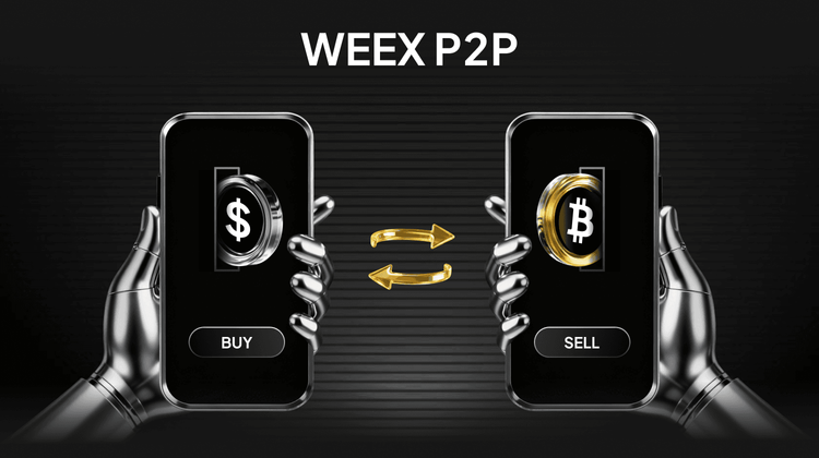
How to Buy Crypto with PKR on WEEX P2P – Fast, Safe & Zero Buyer Fees in Pakistan 2025
Looking to buy crypto with PKR in Pakistan? You’ve landed at the perfect time — and the perfect place. As of December 3, 2025, the Pakistani rupee has slipped past 279 against the dollar (another all-time low), Bitcoin is holding strong above $93,000, Ethereum is riding the post-Pectra upgrade wave, and stablecoins like USDT are the #1 hedge for anyone watching their savings shrink overnight.
But every Pakistani trader knows the pain:
5–15% premiums on local Telegram and Facebook groupsSellers ghosting after you send JazzCash or EasypaisaBank accounts suddenly froze after a big UPI-style transferNon-stop warnings on Twitter and TikTok about scams and fake OTC dealsThe fix? WEEX P2P
Zero buyer fees, verified merchants only, average 30-second releases, and full support for JazzCash, Easypaisa, Raast, SadaPay, NayaPay, and bank transfers. Whether you’re starting with 5,000 PKR or moving crores-worth, you can buy USDT, BTC, ETH, and 300+ other coins with PKR in under 3 minutes — completely safe and FIU-compliant.
What is WEEX P2P? Pakistan’s Smoothest Crypto RampWEEX P2P connects you directly with real, vetted Pakistani merchants while keeping every rupee in escrow until your crypto lands. No middlemen, no shady groups, no “send first, trust me bro” nonsense.
You get 1,000+ live PKR ads 24/7, beginner-friendly steps, and the tightest spreads in the country. Twitter and local crypto communities are full of screenshots showing 15-second trades — because that’s now normal on WEEX.
Why Pakistani Traders Are Switching to WEEX Right NowDitching traditional spot buys for WEEX P2P isn't just smart—it's a game-changer in India's evolving market. Here's why traders are flocking:
0% buyer fee — every rupee becomes crypto (save 5–15% instantly)30-second average release — many merchants auto-release the moment Easypaisa/Raast confirmsVerified merchants only — 98–99% completion rates, no ghosting horror storiesBest PKR rates live — USDT today at 278.90–279.90 PKR (often tighter than anywhere else)Start tiny or go big — from 2,000 PKR test buys to multi-million PKR deals100% escrow protection — your money is locked until you get your coinsStep-by-Step: Buy Crypto with PKR on WEEX in Under 3 MinutesBuying crypto on WEEX P2P is quick, secure, and straightforward. Whether you’re a beginner or an experienced trader, the platform guides you through each step to ensure your purchase is smooth and hassle-free.
Sign Up on WEEX Register on the WEEX website or app using your email or phone, set a secure password, and complete account verification.Verify Your Account (KYC) Upload your ID to unlock full trading features and higher transaction limits.Access Buy Crypto Interface Navigate to Assets → Overview → Buy Crypto, select PKR, and enter the amount you want to buy.Select Payment Method Choose a supported provider (e.g., local bank transfer, Easypaisa, JazzCash) and confirm your preferred option.Pick Crypto You Want to Buy Select some token from the crypto list and confirm your payment currency.Complete the Transaction Follow the payment instructions. Once confirmed, coresponding token will be credited to your WEEX wallet.With this process, buying Ethereum becomes fast, secure, and hassle-free, letting you focus on trading strategies and market opportunities.
Today’s Live Crypto Prices on WEEX P2P (Dec 3, 2025)USDT/PKR: 278.90 – 279.90 (super tight, up 0.1% today)BTC/PKR: 25,950,000 – 26,150,000ETH/PKR: 725,000 – 735,000Rates update every second — check inside the app for the absolute latest.
Frequently Asked Questions (FAQ)Q: Any fees when I buy crypto with PKR?
A: 0% for buyers. Sellers pay a tiny maker fee only.
Q: How fast do I actually get my coins?
A: Average 30 seconds via JazzCash/Easypaisa/Raast. Max 5 minutes.
Q: Is my money safe?
A: 100% — escrow holds your PKR until you confirm receipt of crypto.

Buy Crypto with INR in India 2025 Guide: Fast, Safe & Zero-Fee Trading on WEEX P2P
Looking to buy crypto with INR in India? You're in the right place—and at the perfect time. As of December 3, 2025, the global crypto market is buzzing with cautious optimism. Bitcoin is holding above $93,000 (around ₹7.8 lakh), Ethereum is up 4% following its latest Pectra upgrade, and stablecoins like USDT remain the preferred hedge as the rupee inches toward ₹90+ per dollar.
But Indian traders know the struggle all too well:
P2P premiums of 5–10% on platforms like Binance and WazirXBank freezes from unverified sellersUPI delays, cancelled transfers, and constant risksTwitter filled with warnings about scams and unreliable OTC groupsThe good news? WEEX P2P fixes all of that.
With zero buyer fees, verified merchants, 30-second average releases, and support for UPI, IMPS, and bank transfer, WEEX lets you buy USDT, BTC, ETH, and 300+ cryptocurrencies using INR in under 3 minutes. Whether you're starting with ₹500 or scaling beyond ₹5 lakh, WEEX keeps your trades fast, safe, and compliant with India’s FIU guidelines.
What is WEEX P2P? Your Direct Line to Crypto in IndiaWEEX P2P is a peer-to-peer powerhouse that skips the corporate gatekeepers, linking you straight to trusted Indian sellers who accept local payments like UPI (via PhonePe or GPay) and bank transfers. Every deal? Locked in escrow—your rupees stay safe until crypto hits your wallet, slashing scam risks that plague Telegram groups or unregulated spots. It's not your average exchange; it's flexible for haggling rates, beginner-friendly with guided steps, and loaded with 1,000+ live INR ads 24/7. In a country where crypto's legal but taxed at 30% on gains (plus 1% TDS over ₹50,000), WEEX keeps things transparent, with easy tax reports and no hidden spreads. Twitter users are raving about similar ramps, sharing hacks to avoid P2P pitfalls and score spot rates without the hassle. Bottom line: it's global access with Indian ease, perfect for stacking amid 2025's institutional wave.
Why Buy Crypto with INR on WEEX? The Edge You NeedDitching traditional spot buys for WEEX P2P isn't just smart—it's a game-changer in India's evolving market. Here's why traders are flocking:
Zero Buyer Fees: Save 2-8% compared to WazirX or CoinDCX—no TDS surprises or withdrawal gouges.Lightning Releases: Average 30 seconds via UPI—faster than waiting for IMPS on local apps.Verified Sellers Only: 98%+ completion rates, no ghosting like those Binance P2P horror stories.Best Rates in Real-Time: Tight spreads (e.g., USDT at ₹90.17–₹90.33 today), beating competitors by 0.5-1%.Low Entry Barrier: Start with ₹100-₹500, ideal for testing amid rupee volatility.It's secure (cold storage, 2FA), compliant (FIU-registered vibes), and scales from DeFi dips to long-term holds—exactly what you need as India's crypto adoption hits 20M+ users.
Step-by-Step: Buy Crypto with INR on WEEX P2P in MinutesGrabbing crypto via INR on WEEX feels like a seamless UPI top-up—no jargon, no waits. Here's your quick path, straight from the app:
Sign Up & Verify: Download WEEX (iOS/Android/web), enter your phone/email, set a password—done in 20 seconds. Snap your Aadhaar/PAN for KYC (under 60 seconds approval, unlocking full limits).Hit Buy Crypto: Tap "Buy Crypto" → "P2P Trading" from the dashboard.Pick INR & Payment: Select INR as fiat, filter by UPI/Bank Transfer/IMPS—hundreds of ads pop up, sorted by rate and seller rating.Choose Your Coin: Search USDT, BTC, ETH (or any of 300+), enter amount (e.g., ₹5,000 for ~55 USDT at ₹90.30).Seal the Deal: Review seller details (UPI ID/bank info), send exact INR, tap "Transferred & Notify"—escrow releases crypto instantly (15-60 seconds for most).Wallet It: ETH/BTC/USDT lands in your WEEX spot wallet—trade, stake, or withdraw fee-free.That's it—hassle-free, with built-in tax tracking for India's 30% VDA rules. Pro tip: Start small to test, then scale as Twitter tips suggest arbitraging dips.
Today's Top Crypto Prices on WEEX P2P (Dec 3, 2025)Stay ahead—live INR rates update every second:
USDT/INR: ₹90.17 – ₹90.33 (stable as ever, up 0.02% today)BTC/INR: ₹7,800,000 – ₹7,850,000 (riding $93K USD highs)ETH/INR: ₹260,000 – ₹262,000 (post-upgrade surge)These tight spreads mean more crypto for your rupees—check WEEX for real-time charts.
Frequently Asked Questions (FAQ)Q: What fees should I expect on WEEX P2P? A: Zero for buyers—sellers cover a tiny spread. No TDS extras like some local spots; just pure value.
Q: How quick is crypto delivery after paying INR? A: 30 seconds average via UPI—max 5 minutes for bank transfers. Faster than most Indian exchanges.
Q: Is buying crypto with INR safe on WEEX? A: Absolutely—escrow locks funds, verified sellers only, and FIU-compliant. Ditch the P2P scam fears flooding Twitter.
Elon Musk Calls Bitcoin “True Currency”: What It Means for BTC Markets
Elon Musk has once again stirred the crypto conversation, this time by calling energy the true currency.
The Tesla and SpaceX CEO shared this perspective on the social platform X while engaging in a discussion about money, energy, and artificial intelligence.
Although Musk did not explicitly mention Bitcoin in his statement, the cryptocurrency community was quick to draw a direct connection. Bitcoin has long been framed by its proponents as a form of "stored energy"—a digital asset whose security and issuance are fundamentally backed by real-world electricity and computational power.
As market participants closely monitor Musk’s public remarks, his latest comments have reignited a deeper debate about the nature of value itself, and what role Bitcoin might ultimately play in the future monetary system.
Why Elon Musk Calls Energy as True Currency?Musk’s perspective is grounded in principles of physics and resource economics. Energy is the fundamental input that powers all economic activity—from industrial production to data computation. In this framework, traditional currencies are seen merely as accounting tools to facilitate the transfer and measurement of energy over time and space.
Musk has been openly critical of fiat currency systems, highlighting their susceptibility to manipulation and unlimited issuance. Energy, on the other hand, cannot be created from nothing; its production requires tangible infrastructure, raw materials, and continuous input, imposing natural constraints that stand in contrast to the elasticity of government-issued money.
Proponents of Bitcoin argue that this energy-centric worldview aligns seamlessly with Bitcoin’s design. The mining process deliberately ties the creation of new bitcoins and the security of the network to substantial electricity consumption, thereby anchoring its economic cost in physical reality.
This conceptual link explains why Musk’s statements—even when not naming Bitcoin directly—often trigger speculation and discussion within crypto markets.
How Bitcoin Fits the Energy Narrative?Bitcoin is frequently described as monetized energy. The network’s transaction ledger is secured through a competitive mining process where participants expend electricity to solve cryptographic puzzles. As the price of Bitcoin rises, mining becomes more profitable, attracting greater computational power and further increasing energy consumption—which in turn enhances the network’s security.
Why Supporters Call Bitcoin Conserved Energy?This idea gained significant attention after earlier remarks from Musk describing Bitcoin as “based on energy” and contrasting it with fiat currencies that can be “printed at will.” Core arguments supporting this view include:
Bitcoin’s supply is algorithmically capped at 21 million coins.Mining difficulty automatically adjusts based on the total computational power dedicated to the network.The security of the blockchain scales directly with the amount of real-world energy utilized.Some investors interpret this as a more transparent and constrained monetary system. Critics, however, raise concerns about environmental sustainability and the long-term viability of an energy-intensive consensus mechanism. Regardless of stance, Musk’s commentary consistently brings this tension back into public discourse.
Market Reactions and Investor SentimentWhile Musk’s direct influence on crypto prices has moderated since the peak of the 2020–2021 market cycle, his statements continue to shape trader sentiment and media narratives. Bitcoin’s market movements often correlate as strongly with shifts in conceptual narrative—especially those tied to technology, energy, and macroeconomics—as with specific regulatory or institutional developments.
Why Markets Still Listen to Musk?Musk remains a uniquely influential figure at the intersection of technology, energy, and futurism. His companies, Tesla and SpaceX, are deeply engaged in energy innovation and large-scale infrastructure. Meanwhile, the explosive growth of artificial intelligence is dramatically increasing global electricity demand—a trend that indirectly highlights the themes of energy scarcity and allocation that underpin Bitcoin’s value proposition.
Some analysts believe this broader context reinforces Bitcoin’s long-term narrative as a scarce digital commodity backed by real-world resource expenditure. Musk’s recent allusion to AI as a potential “infinite money glitch” further fuels theoretical discussions about value in a digitized, energy-aware economy.
That said, Musk’s relationship with Bitcoin has been notably nuanced. After a period of overt support, his stance has become more measured, and he continues to express personal favor toward Dogecoin. This ambiguity leads markets to interpret rather than blindly follow his comments, adding a layer of narrative volatility without consistent directional pressure.
ConclusionElon Musk’s characterization of energy as the true currency may read as philosophical, but it resonates deeply with one of Bitcoin’s core value narratives. By framing monetary value in terms of fundamental physical resources, Musk indirectly reinforces the idea that Bitcoin represents a credible alternative to traditional fiat systems—not through direct endorsement, but through conceptual alignment.
For observers and participants in the crypto space, this underscores how Bitcoin’s market valuation is often propelled by ideological and narrative currents as much as by technical or on-chain metrics. As the digital asset landscape continues to mature, engaging with these foundational ideas remains essential for understanding Bitcoin’s potential role in a reimagined global economy.
Ready to trade Bitcoin?Join WEEX now—enjoy zero trading fees, smooth execution, and instant access. Sign up today and start trading in minutes.
Further ReadingHow to Trade Bitcoin Futures on WEEX?What Is Bitcoin and How Does It Work?If You Invested $1,000 in Bitcoin 10 years ago, Here’s How Much You’d Have NowBitcoin at $126,000: What's Next?Disclaimer: The opinions expressed in this article are for informational purposes only. This article does not constitute an endorsement of any of the products and services discussed or investment, financial, or trading advice. Qualified professionals should be consulted prior to making financial decisions.
Which Crypto Will Go 1000x in 2026?
Examining historical 1000x gainers reveals patterns centered on timing, narrative, and network effects rather than predictable fundamentals. Such extraordinary returns typically emerge from assets that started with low valuations, aligned with powerful cultural or technological shifts, and captured momentum at the right phase of a broader market cycle.
Bitcoin (BTC): Initially valued at pennies, Bitcoin introduced decentralized digital scarcity and established a new asset class. Its growth beyond 1000x was fueled by growing institutional trust, global adoption, and its evolution into a macroeconomic reserve asset over multiple cycles.Ethereum (ETH): Launched as a smart contract platform, Ethereum unlocked decentralized applications, DeFi, and NFTs. Early participants realized exponential gains as its ecosystem became the foundation for Web3 innovation.Dogecoin (DOGE): Originally created as a humorous experiment, Dogecoin leveraged community-driven virality and celebrity endorsement to achieve parabolic returns, demonstrating the power of meme culture in financial markets.Shiba Inu (SHIB): Starting with a micro-cap valuation, SHIB capitalized on meme coin mania and retail frenzy, delivering gains measured in tens of thousands of percent through exchange listings and expanding ecosystem narratives.Pepe (PEPE): A 2023 entrant with no functional utility, PEPE illustrated how internet-native memes can rapidly translate into speculative financial assets, briefly generating multi-billion-dollar valuations purely through social momentum.These cases underscore that 1000x outcomes are less about guarantees and more about early exposure, compelling storytelling, and favorable market psychology.
Top Cryptos With 1000x Potential in 2026Identifying tokens with 1000x potential requires a focus on the high-risk, high-reward segment of the market. The following assets represent speculative narratives that could attract extreme capital flows during aggressive bull phases. All projections are illustrative and assume optimal market conditions.
Bitcoin Hyper (HYPER): Positions as a Bitcoin Layer-2 solution aiming to extend functionality beyond store of value. Benefits from strong Bitcoin-centric narratives during BTC-led market cycles.Dogecoin (DOGE): As one of the most recognized cryptocurrencies globally, DOGE retains potential for resurgence driven by community loyalty, social media trends, and celebrity influence.Pepe (PEPE): A pure meme asset relying entirely on cultural virality and speculative momentum, historically capable of rapid multi-billion dollar valuation spikes.Shiba Inu (SHIB): Evolved from a meme token into an ecosystem with its own Layer-2 network, combining community scale with ongoing development to sustain speculative interest.These tokens are characterized by high volatility, narrative dependency, and sensitivity to broader market sentiment. Position sizing and exit planning are critical when engaging with such assets.
High-Growth Cryptos That Could Still Deliver Significant ReturnsNot all opportunities require extreme risk. Many investors achieve substantial returns through established projects with clearer fundamentals, growing adoption, and ecosystem maturity. While unlikely to deliver 1000x from current valuations, these assets can still produce strong performance in favorable market conditions.
Maverick Protocol (MAV): A decentralized exchange emphasizing capital efficiency for liquidity providers. Positioned to benefit from renewed DeFi activity and trading volume expansion in bull markets.Sui (SUI): A high-throughput Layer-1 blockchain focused on consumer applications like gaming and payments. Gains traction through developer adoption and scalability narratives.Aptos (APT): A scalable Layer-1 with institutional backing, increasingly associated with real-world asset tokenization and enterprise use cases.These projects represent a more balanced risk-return profile, appealing to investors seeking exposure to crypto growth with relatively stronger fundamental grounding.
Can These Cryptos Make You a Millionaire?The possibility exists, but it is contingent on specific and often unforgiving conditions. True millionaire-making outcomes typically require:
Exceptionally early entry before broad recognitionFavorable macro and market cycle timingDisciplined position management and profit-takingMost successful crypto wealth stories involve a portfolio approach, where one or two high-conviction winners offset other positions. Equally important is the discipline to secure gains—many paper millionaires fail to realize profits by holding through volatile downturns.
While the assets discussed could theoretically generate life-changing returns, achieving such results depends far more on strategy, risk management, and emotional control than on merely selecting the "right" token.
Conclusion: Which Crypto Will Give 1000x in 2026?There is no definitive answer, as 1000x returns are inherently unpredictable and historically rare. They tend to emerge from narratives that resonate deeply during specific market phases, often beginning as overlooked or dismissed ideas.
Investors should balance ambition with pragmatism: high-risk meme and narrative-driven tokens offer theoretical upside but come with extreme volatility and failure rates. More established projects provide growth potential with comparatively lower risk.
Ultimately, the search for exponential returns is less about prediction and more about preparation—staying informed, managing exposure, maintaining discipline, and recognizing that in crypto, timing and psychology often outweigh fundamentals in the short to medium term.
Further ReadingWhat Is Dogecoin and How Does It Work?What Is Ethereum and How Does It Work?What Is Shiba Inu and How Does It Work?Disclaimer: The opinions expressed in this article are for informational purposes only. This article does not constitute an endorsement of any of the products and services discussed or investment, financial, or trading advice. Qualified professionals should be consulted prior to making financial decisions.
What is RSI Divergence and How It Works?
RSI divergence occurs when an asset's price moves in one direction while its Relative Strength Index (RSI) moves in the opposite direction. This discrepancy between price action and underlying momentum often indicates potential trend weakening or a forthcoming reversal.
Traders use RSI divergence as an early signal that a prevailing trend may be losing strength, which can help identify potential market tops or bottoms. The concept is applicable across various timeframes and can assist in decisions to enter, exit, or adjust positions.
What is the RSI and How Is It Calculated?The Relative Strength Index (RSI) is a momentum oscillator that quantifies the magnitude and speed of price changes over a defined period—typically 14 periods. The index oscillates between 0 and 100.
In essence, RSI compares the average gains and losses over the selected period. A higher RSI (closer to 100) indicates stronger buying momentum, while a lower RSI (closer to 0) reflects stronger selling pressure. Levels above 70 are generally considered overbought, and levels below 30 are viewed as oversold—conditions that may precede price reversals.
Most modern trading platforms calculate RSI automatically, allowing traders to focus on interpretation rather than computation. Due to its clarity and adaptability, RSI is widely used across equities, forex, and cryptocurrency markets.
How to Define RSI Divergence?Divergence is identified when the price forms a new high or low that is not confirmed by a corresponding new extreme in the RSI.
Bullish Divergence: Price records a lower low, while RSI forms a higher low.Bearish Divergence: Price makes a higher high, while RSI makes a lower high.These patterns suggest underlying momentum is weakening, even if price action appears strong. Divergences do not guarantee reversals but increase the probability of a shift when observed within a broader technical context. Traders often use historical backtesting to assess the reliability of divergence signals in different market environments.
Types of RSI DivergenceRegular Bullish Divergence Occurs during a downtrend: price makes lower lows, but RSI forms higher lows. This signals decreasing selling pressure and may precede a bounce or trend reversal upward.Regular Bearish Divergence Appears in an uptrend: price reaches higher highs, while RSI makes lower highs. This indicates fading bullish momentum and can be used to prepare for short entries or exit long positions.Hidden Bullish Divergence Observed in an uptrend: price forms a higher low, but RSI prints a lower low. This suggests the underlying uptrend remains intact and a pullback may be ending.Hidden Bearish Divergence Seen in a downtrend: price makes a lower high, while RSI creates a higher high. This reinforces the ongoing downtrend and can be used to add or maintain short positions during retracements.Recognizing these variations helps traders align decisions with the prevailing market structure.
How to Spot RSI Divergence?Apply a 14-period RSI to your price chart.Identify significant highs and lows in both price and RSI.Draw trendlines connecting these extremes in each window.Look for opposing slopes between the price and RSI trendlines—this confirms divergence.Use breaks of key support/resistance or trendline violations as additional confirmation before acting on the signal.When Does RSI Divergence Work Best?RSI divergence tends to be more reliable on higher timeframes—such as daily or weekly charts—and after a sustained directional move. It is less effective during parabolic or extremely strong trends, where momentum and price may remain disconnected for extended periods.
Context is critical. Combining divergence with other confirming factors—such as key support/resistance levels, volume patterns, or candlestick formations—increases the robustness of the signal.
Common RSI Divergence PitfallsDivergence signals possible weakening, not certain reversal. Strong trends may consolidate before resuming.Signals can be invalidated if price continues to make new extremes despite RSI divergence.Lower timeframe divergences carry less weight and often indicate only short-term corrections within a larger trend.Overreliance on divergence without confluence from other indicators increases risk.General RSI Trading GuidelinesUse RSI alongside other technical tools to build a multi-factor view of market conditions.Analyze multiple timeframes to gauge the strength and scope of a potential reversal.Always define invalidation levels and employ stop-loss orders to manage risk.Trade in probabilities, not certainties—no signal guarantees success.Exercise patience: wait for confluence rather than entering solely on divergence.Consider intermarket dynamics, especially in crypto—Bitcoin’s trend often influences altcoin behavior.Base divergence analysis on closing prices rather than intra-candle wicks for clearer signals.Trading Strategies Using RSI Divergence
Reversal Strategy (Regular Divergence)Entry: After confirmation, such as RSI crossing a key level or price breaking a trendline.Stop-loss: Placed beyond the recent swing high/low.Take-profit: Set near previous support or resistance.Trend Continuation Strategy (Hidden Divergence)Entry: On a pullback within a prevailing trend, supported by hidden divergence.Confirmation: RSI crossing back above/below 50, or price resuming its trend direction.Real-World Example: Bitcoin in Late 2022
In November 2022, Bitcoin established a significant market bottom near $15,500. Analysis of the weekly chart revealed a clear bullish divergence: price made a lower low while RSI formed a higher low. This was accompanied by a volume spike at the lows—a common capitulation signal—before the market reversed into a new uptrend.
ConclusionRSI divergence is a valuable technical tool for identifying potential trend reversals and continuations. Regular divergences often flag trend changes, while hidden divergences support staying with the existing trend. By integrating these patterns into a structured trading plan—supported by risk management and additional technical confirmation—traders can enhance decision timing and trade with greater discipline. Remember, divergence alone does not assure success, but it provides probabilistic signals that can improve overall trading effectiveness when used thoughtfully.
Further ReadingWhen the Market is Down, What Should We Do?What Are Crypto Signals and How to Use them?Crypto Trading vs.Traditional Investment, What's the Difference?Disclaimer: The opinions expressed in this article are for informational purposes only. This article does not constitute an endorsement of any of the products and services discussed or investment, financial, or trading advice. Qualified professionals should be consulted prior to making financial decisions.
The Fed Cuts Rates Again: How This Macro Impact Crypto In 2026?
When the Federal Reserve lowers interest rates, several systemic shifts typically unfold: borrowing costs decrease, financial system liquidity expands, the U.S. dollar often softens, and investor capital tends to migrate toward higher-growth, higher-risk assets. Cryptocurrency markets frequently respond more swiftly to accommodative monetary policy than traditional equities do, positioning digital assets as early beneficiaries of a dovish pivot. While short-term volatility persists, the directional shift in Fed policy establishes an important macro backdrop for longer-term positioning in Bitcoin, Ethereum, and select altcoins.
The Fed Is Adding LiquidityThe Fed’s accompanying announcement to purchase $40 billion in Treasury bills over the next 30 days represents a deliberate injection of liquidity into the financial system. Such operations increase the supply of available capital, which historically flows into risk-on markets—including cryptocurrencies. This liquidity supports not only core assets like Bitcoin and Ethereum but also extends to large-cap altcoins and high-activity thematic sectors such as AI-driven tokens, layer‑2 scaling solutions, and real-world asset (RWA) protocols.
Why Crypto Has Not Surged Immediately?Despite the policy shift, cryptocurrency markets have not exhibited an immediate, broad-based rally. Several factors contribute to this delayed reaction:
Recent Market Stress: Significant liquidations and selloffs in prior sessions have left traders in a cautious, wait-and-see posture.Desire for Confirmation: Participants often await subsequent Fed communications, updated economic projections, and tangible evidence of sustained liquidity before committing capital decisively.Residual Macro Uncertainty: Commentary regarding labor market revisions and persistent inflation concerns continues to influence near-term sentiment.While the initial price response may be muted, a sustained shift toward easier monetary policy typically lays the groundwork for stronger performance in subsequent crypto market phases.
How This Macro Impact Crypto In 2026?Should the Fed maintain or extend its current dovish trajectory, several developments could unfold in cryptocurrency markets through 2026:
Gradual but steady capital inflows into Bitcoin and EthereumAccelerated recovery and rotation within altcoin sectorsRenewed interest in thematic narratives such as AI, layer‑2 scaling, and tokenized real-world assetsEnhanced trading opportunities amid structurally higher volatility environmentsMacro policy conditions often exert greater influence on crypto market cycles than individual news events, and a sustained move toward lower rates historically supports extended upward trends over time.
What Traders Should Consider?A practical monitoring framework in the current environment includes:
Bitcoin Dominance: BTC frequently leads during macro-driven inflection points.U.S. Dollar Index (DXY): A weakening dollar generally correlates with strength in Bitcoin and Ethereum.Sector Rotation: Tokens tied to AI, RWAs, and layer‑2 infrastructure often exhibit early momentum when liquidity conditions improve.Fed Communication: Forward guidance regarding the pace and extent of future rate cuts can trigger immediate market responses.ConclusionThe Federal Reserve’s latest 25‑basis‑point rate cut—the third of the year—coupled with its announced Treasury bill purchases, marks a clear transition toward more accommodative monetary policy. While cryptocurrency prices may not react instantaneously, these developments contribute to a macro foundation that has historically supported renewed market expansion. Traders who contextualize price action within this shifting liquidity and rate environment may be better positioned to navigate the evolving landscape through 2026.
Further ReadingGlobal Crypto Regulation 2025: Everything You Must KnowWhat Crypto Traders Do in a Bearish Market 2025?If You Invested $1,000 in Bitcoin 10 years ago, Here’s How Much You’d Have NowDisclaimer: The opinions expressed in this article are for informational purposes only. This article does not constitute an endorsement of any of the products and services discussed or investment, financial, or trading advice. Qualified professionals should be consulted prior to making financial decisions.
Global Crypto Regulation 2025: Everything You Must Know
Cryptocurrency has evolved into a significant global asset class, with its total market capitalization surpassing $3 trillion in recent years. As adoption continues to expand, governments worldwide are grappling with the complex task of regulating a technology that is at once innovative, decentralized, and highly volatile. The result is a diverse and often fragmented landscape of Global Crypto Regulation—spanning from outright prohibition to proactive legal frameworks designed to foster innovation.
In 2025, this landscape can generally be categorized into four distinct approaches adopted by different jurisdictions, each reflecting varying levels of acceptance, control, and strategic intent.
Red Light CountriesThese nations maintain stringent prohibitions or severe restrictions on cryptocurrency activities, often citing concerns related to financial stability, capital controls, or national security within their Global Crypto Regulation framework.
China: While continuing to promote its central bank digital currency (the digital yuan) and supporting blockchain infrastructure, China upholds a comprehensive ban on cryptocurrency trading and mining. Enforcement measures include monitoring, fines, and in some cases, criminal penalties.Algeria: The possession, trading, or promotion of cryptocurrencies is criminalized, with violations carrying the risk of significant fines and imprisonment.Despite these prohibitions, peer-to-peer and underground trading often persist, driven by public demand and the borderless nature of digital assets, challenging the enforcement of strict Global Crypto Regulation.
Yellow Light CountriesJurisdictions in this category permit cryptocurrency under a regulated framework, emphasizing legal clarity, consumer protection, and anti-money laundering (AML) compliance as part of their approach to Global Crypto Regulation.
European Union: The Markets in Crypto-Assets (MiCA) regulation establishes comprehensive licensing requirements for exchanges, stablecoin issuers, and other crypto service providers, representing a major milestone in Global Crypto Regulation. The Digital Operational Resilience Act (DORA) further strengthens cybersecurity and operational standards.Japan: Recognized as an early adopter of crypto regulation, Japan requires exchanges to register with the Financial Services Agency (FSA), implement strict KYC/AML procedures, and adhere to custody and reporting rules.These regulatory environments seek to balance innovation with oversight, providing a structured pathway for legitimate crypto businesses to operate within the evolving Global Crypto Regulation landscape.
Green Light CountriesThese nations actively encourage cryptocurrency adoption and aim to position themselves as hubs for digital asset innovation and investment, often through progressive Global Crypto Regulation.
United Arab Emirates: Through regulatory bodies such as the Virtual Assets Regulatory Authority (VARA) in Dubai and the Financial Services Regulatory Authority (FSRA) in Abu Dhabi, the UAE has created clear, progressive frameworks that attract global crypto enterprises and set benchmarks in Global Crypto Regulation.El Salvador: While maintaining Bitcoin as legal tender, the country has faced implementation challenges and has adjusted certain policies in response to practical and economic considerations, offering a unique case study in Global Crypto Regulation.Such jurisdictions often leverage crypto-friendly policies to stimulate technological development, foreign investment, and financial inclusion.
Roadwork or Under ConstructionA number of countries are still in the process of developing comprehensive crypto regulations, resulting in a state of legal ambiguity or selective enforcement that complicates Global Crypto Regulation coherence.
India: While applying certain AML measures and tax reporting requirements, India has yet to enact a holistic crypto law, leaving businesses and users in a gray area within the broader context of Global Crypto Regulation.Nigeria: The country has taken steps to recognize cryptocurrencies as securities, but regulatory consistency and enforcement remain uneven.In these markets, uncertainty can both hinder institutional participation and create opportunities for adaptive local ecosystems, highlighting the uneven pace of Global Crypto Regulation development.
Major Crypto Laws and Compliance Trends in 2025United States
The GENIUS Act focuses on stablecoin regulation, mandating full reserve backing, regular audits, and consumer protections, reflecting a significant development in Global Crypto Regulation.The CLARITY Act seeks to distinguish between digital commodities and securities, while the Anti-CBDC Surveillance State Act aims to restrict the deployment of a U.S. central bank digital currency without explicit congressional approval.European Union
MiCA provides a unified regulatory framework for crypto-assets across the EU, covering licensing, transparency, and governance, representing a cornerstone of European Global Crypto Regulation.DORA imposes stringent operational resilience and cybersecurity requirements on financial entities, including crypto service providers.Asia
Hong Kong’s Stablecoins Ordinance introduces a licensing regime for issuers, requiring full asset backing and regular reporting, contributing to the maturation of Global Crypto Regulation in the region.Singapore’s FIMA Act expands the Monetary Authority of Singapore’s oversight to include crypto derivatives and enhances its inspection powers.Middle East
UAE’s VARA regulates a wide range of virtual asset activities, including issuance, exchange services, and custody, serving as a model for progressive Global Crypto Regulation.Abu Dhabi’s FSRA enforces licensing, minimum capital requirements, and restrictions on privacy-focused tokens and algorithmic stablecoins.These legislative developments reflect a global trend toward greater transparency, risk mitigation, and institutionalization of the crypto sector within the broader context of Global Crypto Regulation.
How Global Crypto Regulation 2025 Will Impact?For InvestorsClear regulatory frameworks in Global Crypto Regulation help reduce fraud, provide tax guidance, and enhance market integrity, though compliance requirements may also increase operational complexity.
For BusinessesAdherence to Global Crypto Regulation can serve as a competitive differentiator, enabling access to broader markets and fostering trust among users and partners.
For Global MarketsHarmonized rules—or at least mutually recognized standards—in Global Crypto Regulation facilitate cross-border services, liquidity flows, and international cooperation in supervision and enforcement.
Trends to WatchIncreased focus on stablecoin reserve transparency and issuer accountability within Global Crypto Regulation frameworks.Growth of multi-jurisdictional licensing models for global crypto platforms in response to evolving Global Crypto Regulation.Emerging markets exploring adaptive regulatory sandboxes to attract fintech innovation while shaping their own approaches to Global Crypto Regulation.ConclusionThe landscape of Global Crypto Regulation in 2025 is characterized by significant diversity, reflecting differing national priorities, risk appetites, and economic strategies. From restrictive bans to innovation-friendly frameworks, each approach shapes how digital assets are accessed, used, and integrated into the broader financial system.
As Global Crypto Regulation continues to mature, participants across the ecosystem—from individual users to institutional players—will benefit from staying informed, engaging compliantly, and adapting to an environment where legal clarity is increasingly synonymous with sustainable growth.
Ready to be part of this evolving crypto revolution? Join WEEX today — where innovation meets compliance and opportunity awaits. Sign up now and start trading securely in a globally connected marketplace!
Further ReadingHow to Trade Bitcoin Futures on WEEX?What Is Bitcoin and How Does It Work?If You Invested $1,000 in Bitcoin 10 years ago, Here’s How Much You’d Have NowBitcoin at $126,000: What's Next?Disclaimer: The opinions expressed in this article are for informational purposes only. This article does not constitute an endorsement of any of the products and services discussed or investment, financial, or trading advice. Qualified professionals should be consulted prior to making financial decisions.
BOB Airdrop 50,000 USDT – New User Welcome Reward | Deposit, Trade & Earn
Event Period:
2025/12/04 18:00:00 – 2025/12/11 18:00:00 (UTC+8)
BOB is creating a next-generation Bitcoin DeFi Gateway, combining Bitcoin’s security with Ethereum’s flexibility. As a leading hub for Bitcoin liquidity and decentralized applications, BOB allows users and institutions to unlock real utility within the Bitcoin ecosystem.
To celebrate, WEEX is launching a 50,000 USDT BOB Airdrop exclusively for new users. Complete simple tasks to earn spot and futures rewards, plus access a shared prize pool.
Event 1: First Deposit & Spot Trade (Get 10 USDT)Make a net deposit ≥ 100 USDTHold the deposit until the event endsComplete your first spot trade in eligible tokensReward: 10 USDTLimited to 1,000 participants (first-come, first-served)This task is designed to help new users start trading on WEEX while earning stable rewards.
Event 2: Futures Trading Volume Task (Earn up to 20 USDT + Bonus)Reach the designated futures trading volume in any contract to claim:
Base RewardRequired Trading Volume5 USDT500 USDT10 USDT5,000 USDT20 USDT10,000 USDTAdditionally, users completing Event 1 can claim an extra 5 – 10 USDT futures bonus.
Rewards are limited to 1,000 participants.
This pool encourages deeper engagement for users exploring futures trading on WEEX.
Reward EligibilityTo claim all rewards:
Complete Event 1 → Event 2 in sequenceUsers who do not follow the order will not be eligible for reward distribution.Why Join the BOB Airdrop?50,000 USDT total rewardsEasy onboarding tasksExtra futures bonusesShared prize pool for active tradersLimited-quota, high-value new user eventThis is one of the highest-value BOB ecosystem onboarding events, ideal for users starting their Bitcoin DeFi journey on WEEX.
Popular coins
Customer Support:@weikecs
Business Cooperation:@weikecs
Quant Trading & MM:[email protected]
VIP Services:[email protected]